Color decisions of wallpaper in the interior
When choosing a wallpaper, customers face obvious difficulties, especially in the light of the modern variety of materials for their production, quality, manufacturing companies, and, of course, color solutions. If there is a financial opportunity, you can instruct a good designer to take part in the design of the room. However, if you want to do it with your own hands, there is always the opportunity to independently study what the best color solutions for wallpapers in the interior can be.
General rules of choice
There are some simple rules to follow which is important. They will help to correctly and tastefully arrange the wallpaper in the interior. It all depends on which element the room owner wants to focus on.If you want to focus on the wallpaper, you can safely decorate the walls with products of bright colors with a large and textured pattern. Often, and vice versa: the owner wants the attention of the guests, first of all, to stop at the furniture. Then it is better to paste over the walls with wallpaper with a small pattern, and it is preferable to choose pale colors or any pastel colors, for example, peach, olive, sandy colors.
If options are selected for the office or bedroom, the colors are preferable to calm, and the texture is even, without bright and fancy drawings that will interfere with concentrating while working or fall asleep. For a small room, wallpapers that visually expand the space are best suited - without a pattern, any bright shade. It is not necessary to glue the small room with dark canvases - this will create an even greater effect of reducing the area.

Do not forget about which side of the world the windows of the room are facing. If this is the north side, it is preferable to choose a white background with a discreet repeating pattern or pastel-colored wallpaper. The excess portion of sunlight, which will always be present on the south side of the windows,should be compensated by a cold range: all blue, blue, violet colors, as well as turquoise, lime green and azure will do.
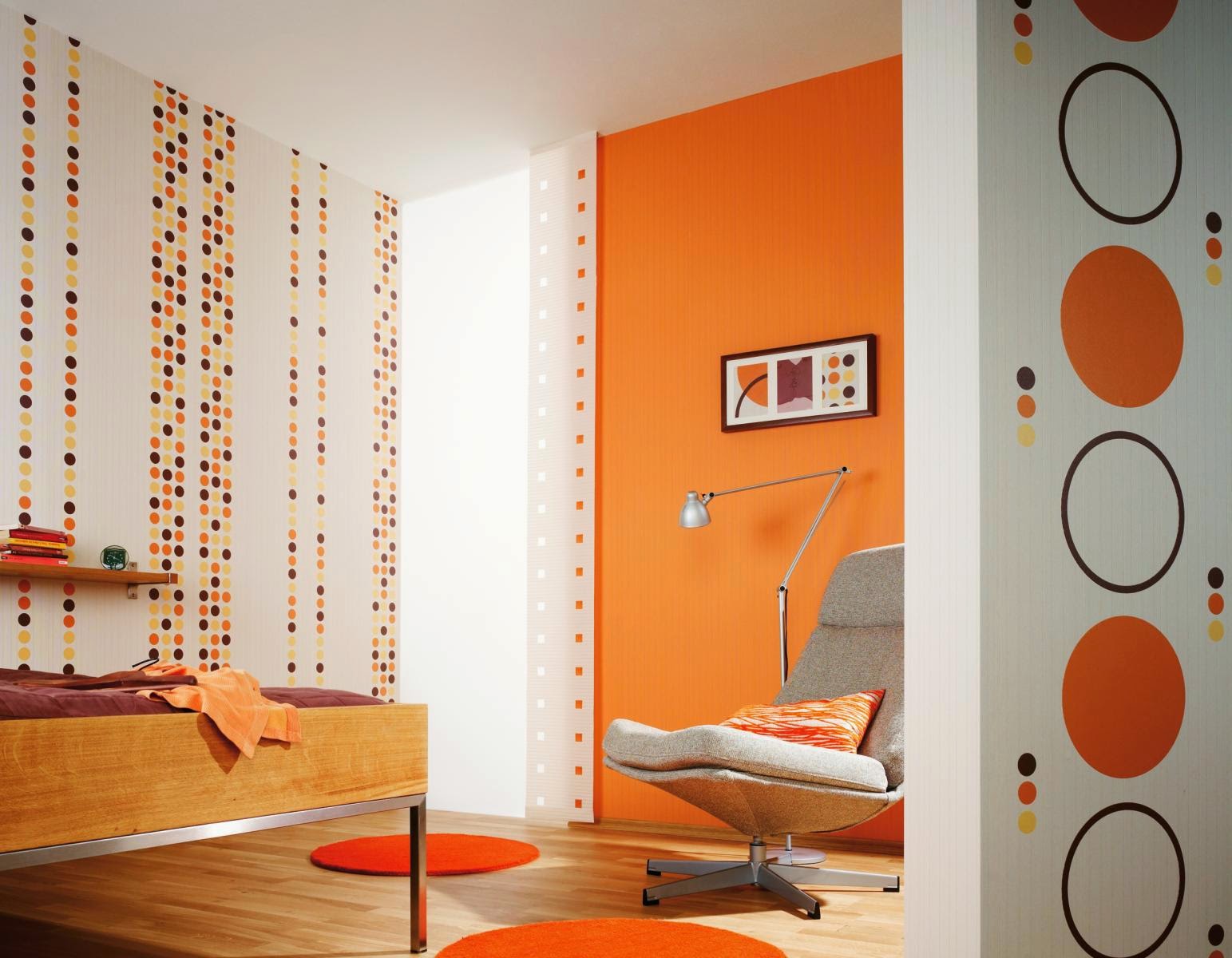
If the room is always cool, it is recommended to make it more “warm” by choosing the appropriate wallpaper colors: burgundy, orange, any chocolate shade.
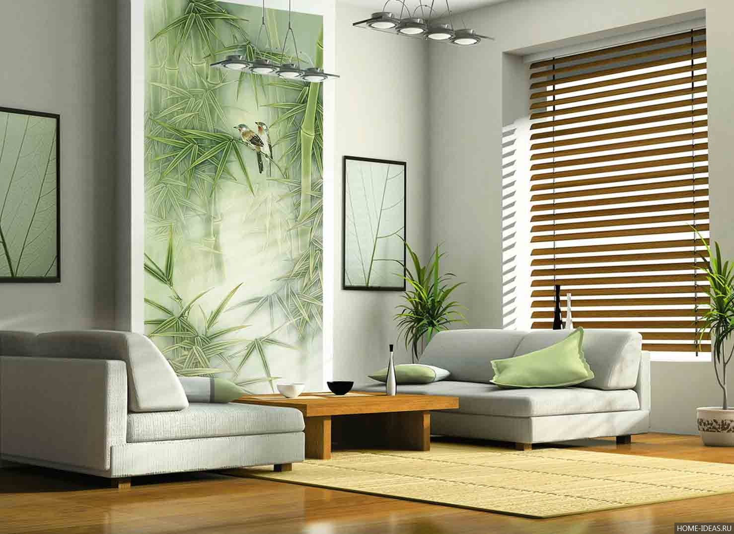
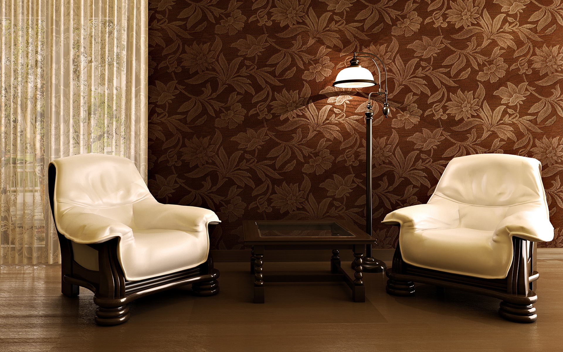
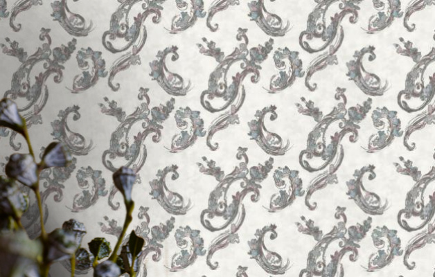
Fashionable prints with imitation of natural colors of stones and trees will best fit into the country or garden ensemble. One of the most unusual and, perhaps, difficult options are wallpapers with complex geometric patterns.


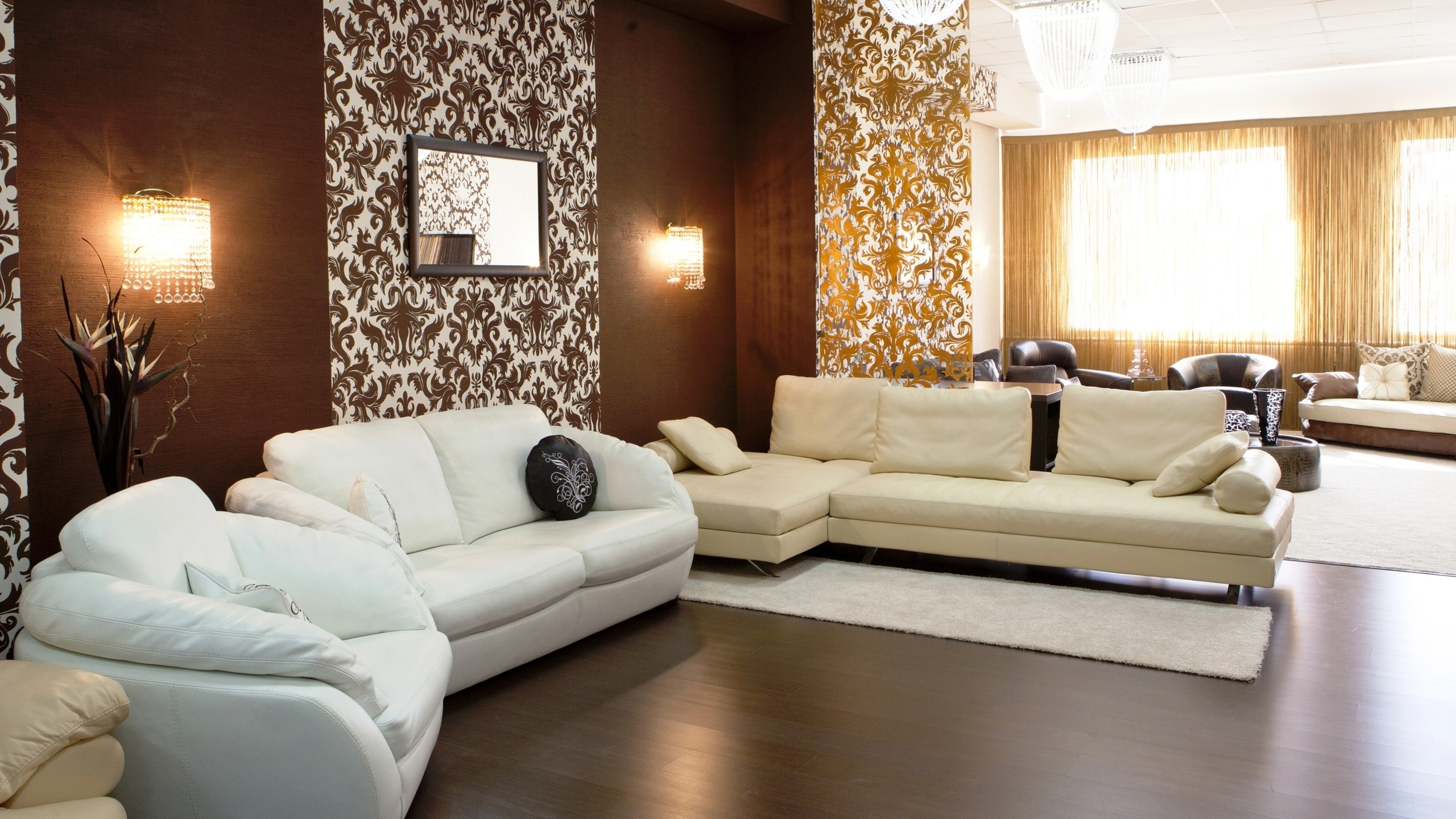
With geometric shapes
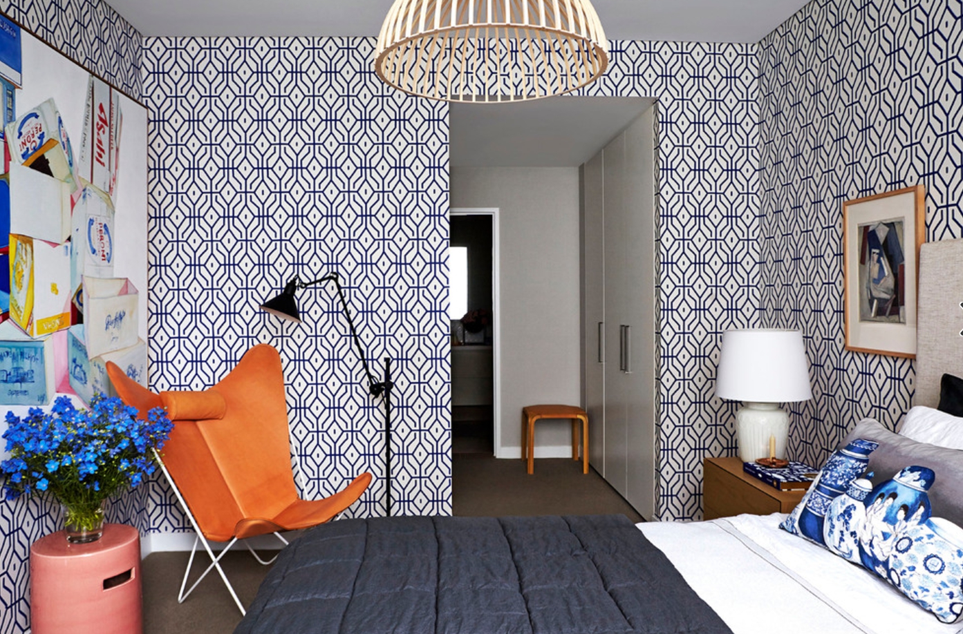
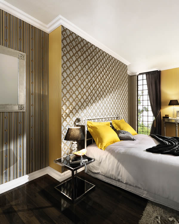
This is a know-how that began to gain popularity due to the fact that more and more consumers began to appear, wanting to decorate their space in one of the modern interior styles, for example, high-tech or minimalism. Wallpaper with geometric patterns can be attributed to any model, which depicts different shapes: diamonds, squares, rectangles. Among these options you can find wallpaper with circles of different colors and sizes, as well as colored zigzag patterns “missons” that will organically fit into a certain style of modern furnishings such as high-tech or eclecticism.

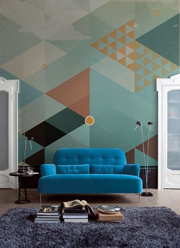
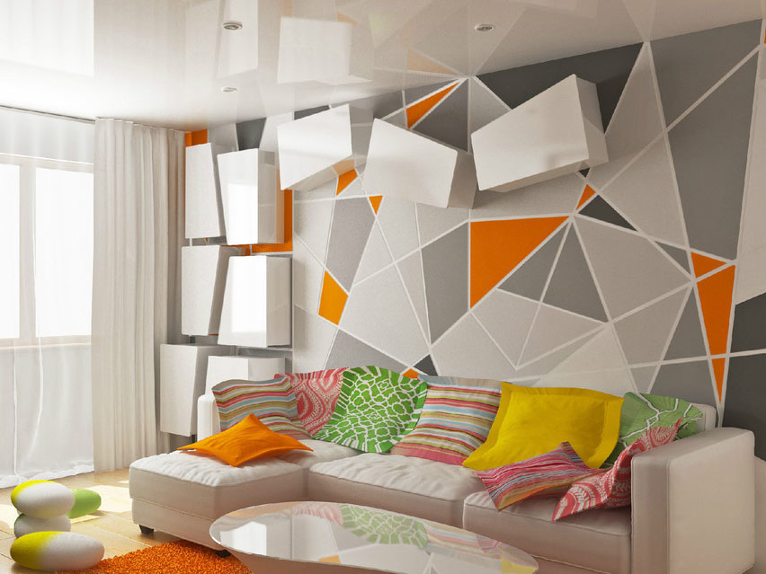
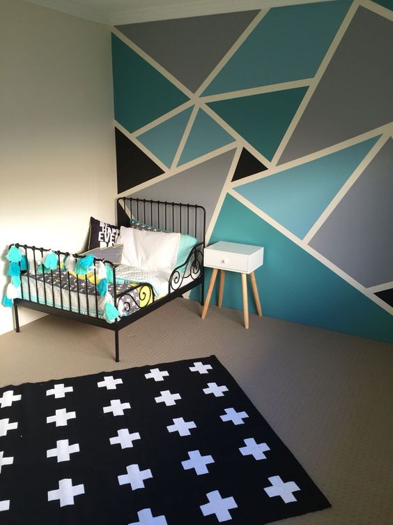
Immediately it should be said that it is very difficult to choose the most suitable “figured” wallpaper, so if you intend to stay on such an unusual solution, it is best to trust the taste of a professional designer who will help you avoid many mistakes when choosing.
There are several basic rules that are strongly recommended to use when selecting wallpapers with geometric elements:
- You should not abuse excessive originality and acquire too complicated texture of the pattern: excessive clutter of shapes and colors will make the room uncomfortable and difficult to perceive.
- It is important to take into account such a factor as the combination of several colors, which is very typical for "geometric" models of wallpaper - so that the colors of other interior items are not part of a sharp dissonance.
- In the case of the presence in the house of just such non-standard clothing for the walls, the furniture should be solid, with smooth contours and smooth transitions, without any sharp corners. If you ignore this advice of professionals, the room will look like tasteless jumble of chaotically intersecting lines that does not contribute to the creation of a cozy space.

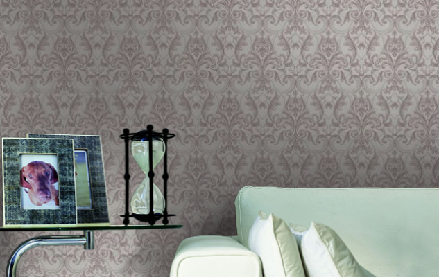
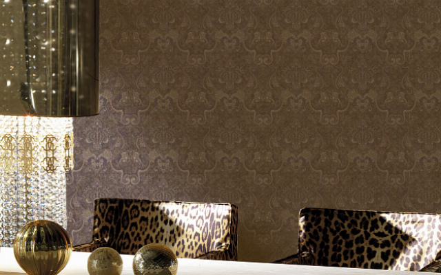
Solid colors
Many monophonic models seem boring and uninteresting, but this is far from being the case, especially if the person is a newcomer in interior design, but nevertheless wants to decorate his room on his own, without resorting to the services of professional designers. Because of its simplicity and universality, this type of wallpaper is especially in demand. Most often these are neutral muted colors that are not striking, which ensures the ease of selection of furniture, curtains and other furnishings. In this case, you need to be guided by an uncomplicated principle: if the walls are light, the furniture should be darker by at least one tone so that it does not merge with the walls, but look most advantageous. If the room is planned furniture furnishings in light colors, the wallpaper can pokleit darker.
Models differ with both the presence and the absence of a pattern, but neither one nor the other will ever look annoying and too bright.
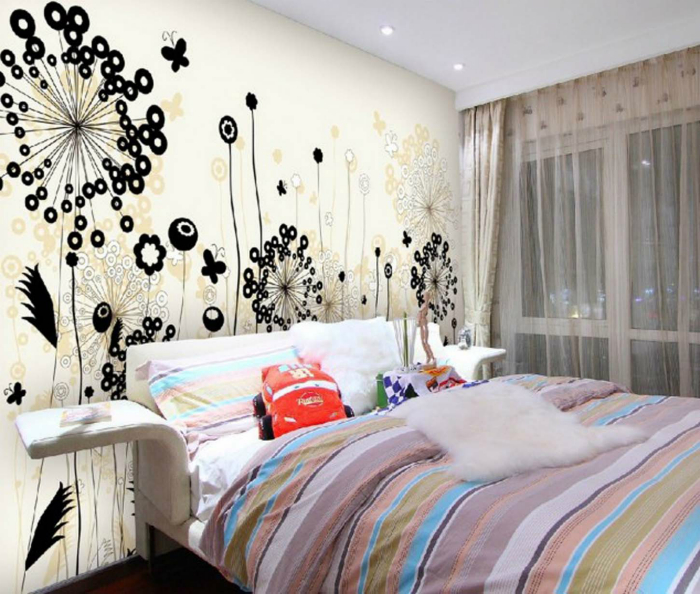
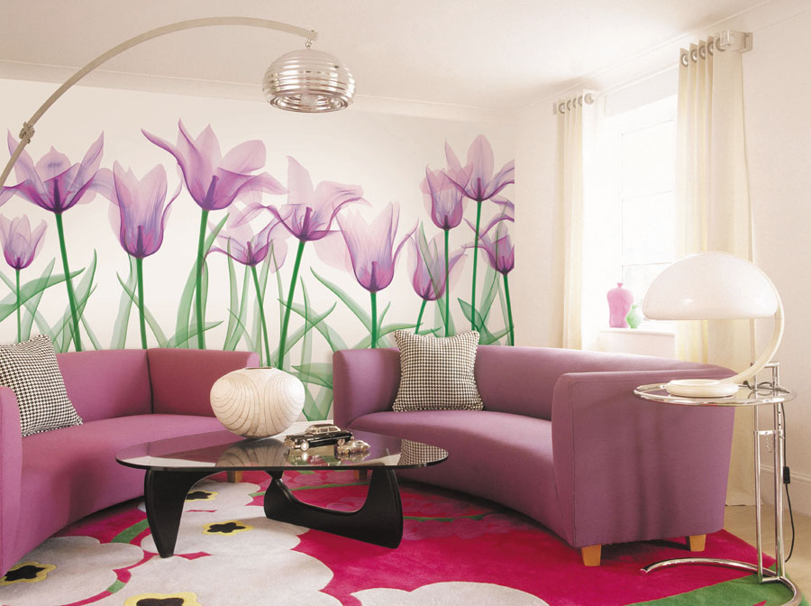
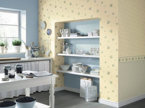
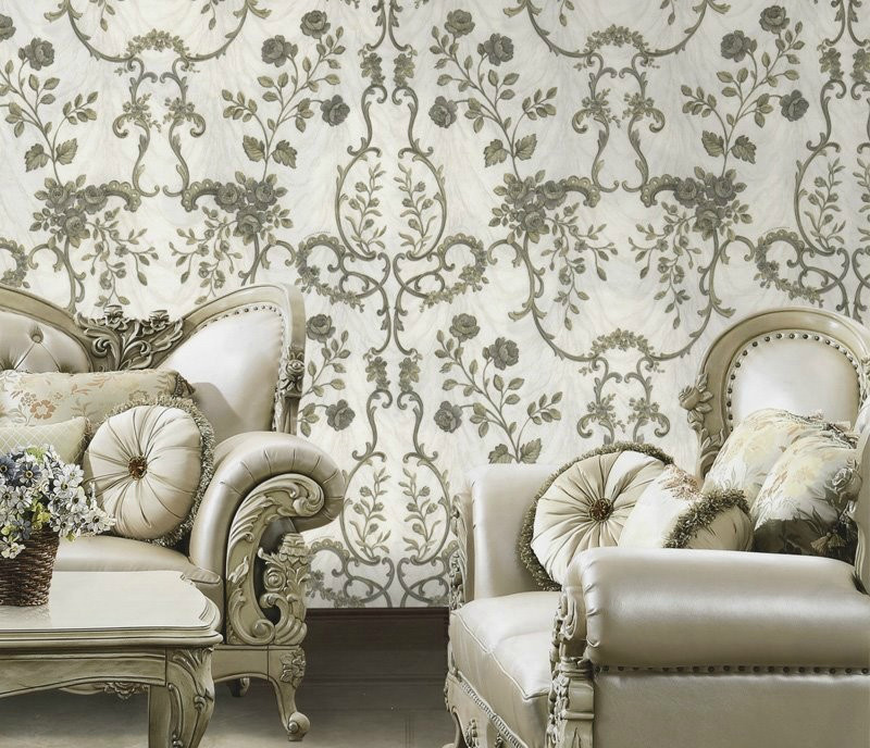
With floral pattern
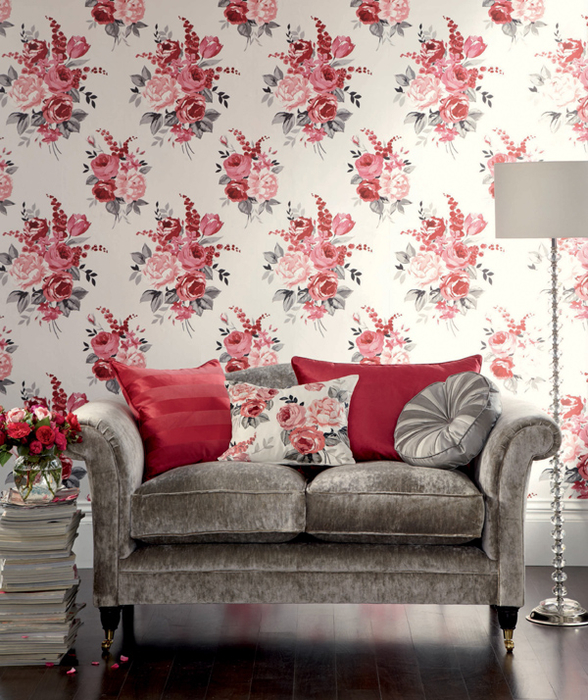
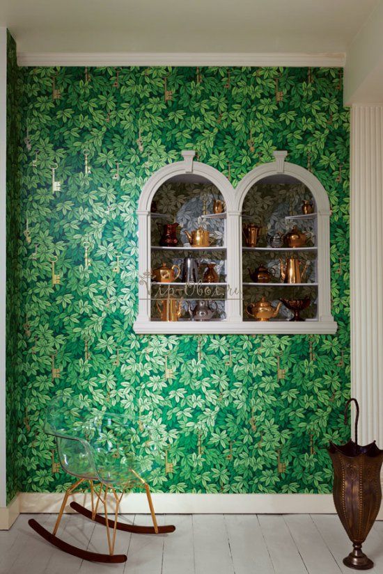
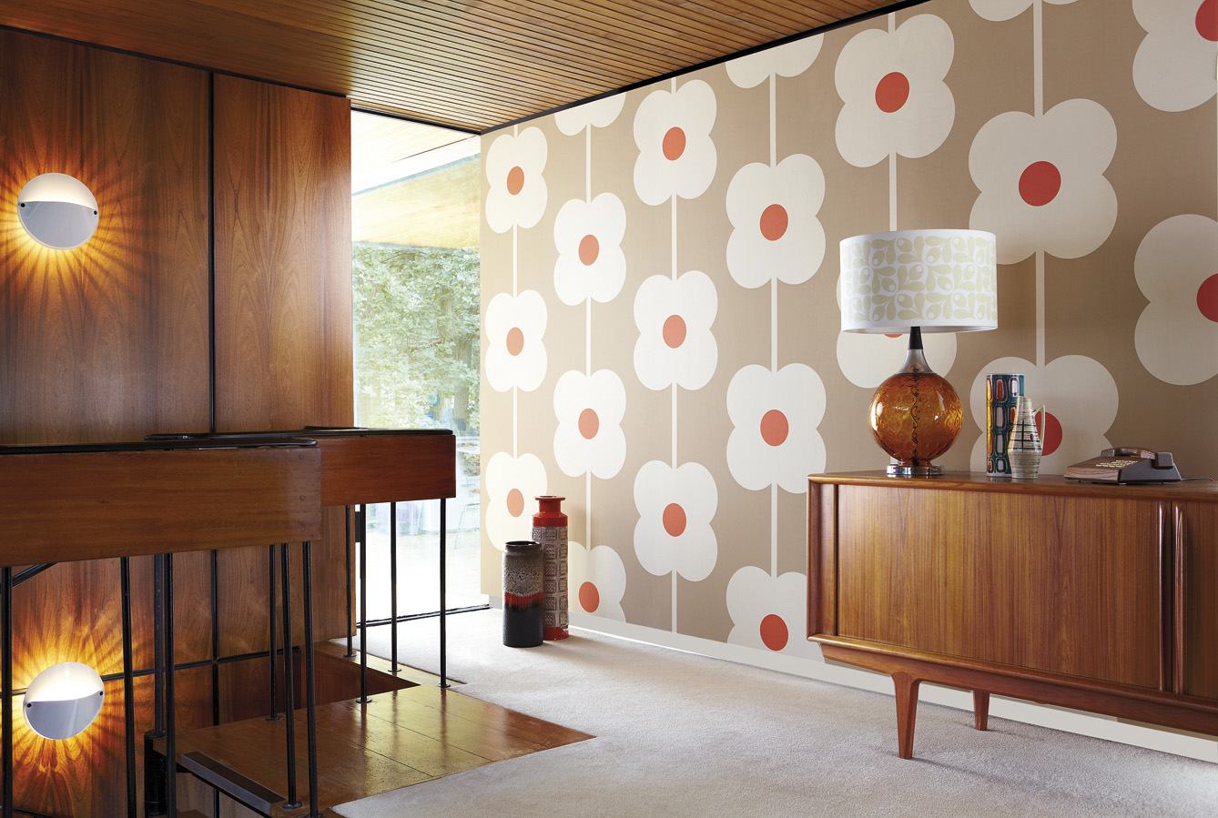
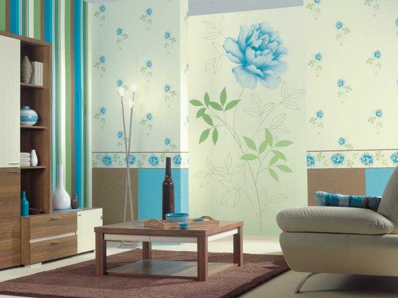
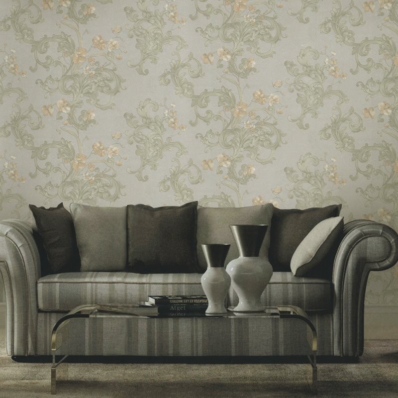
Different stems, twigs, leaves - familiar and loved by many version of the wallpaper, which never goes out of fashion.They are remarkable in that the colors used in the manufacture of prints are usually pastel and not particularly bright. The only nuance when sticking is the need to “fit” the ornament, its connection. The pastel range of colors will always become a very favorable background in the event that the situation in the room itself is bright and creative, and its owner often likes to rearrange or update his interior.

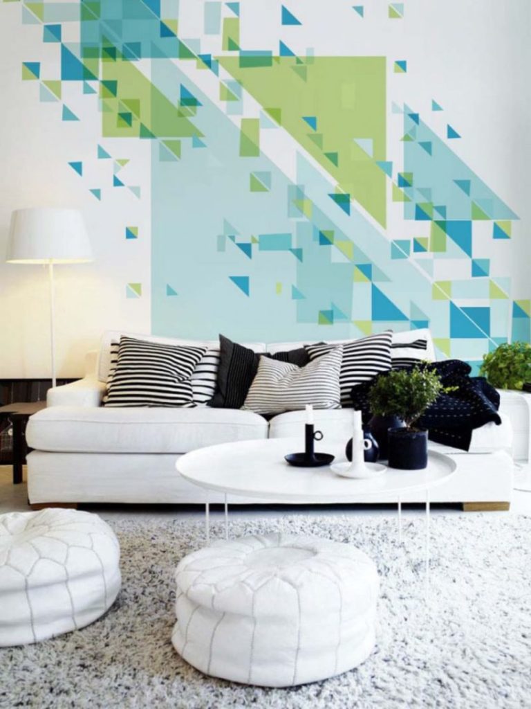
With abstraction
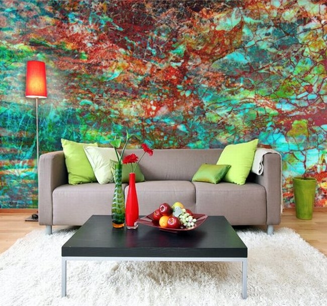
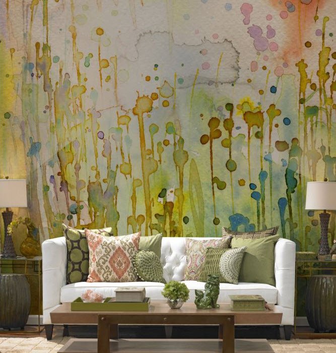
Abstract pattern on the wallpaper is most often made in the form of a chaotic and contrasting ensemble of bright spots or smears and stains. Often they seem tasteless and alyapisty, but this is not entirely true. If you put them in a modern setting with monochromatic furniture of bright colors, they will look very beautiful and appropriate. If they are dominated by light spots (yellow, orange, blue), the furniture should be chosen any tone available in the palette, sometimes with a darker shade, depending on the overall creative picture. The advantage of abstract models is that they do not need to dock with each other, and they will look best in modern interiors.
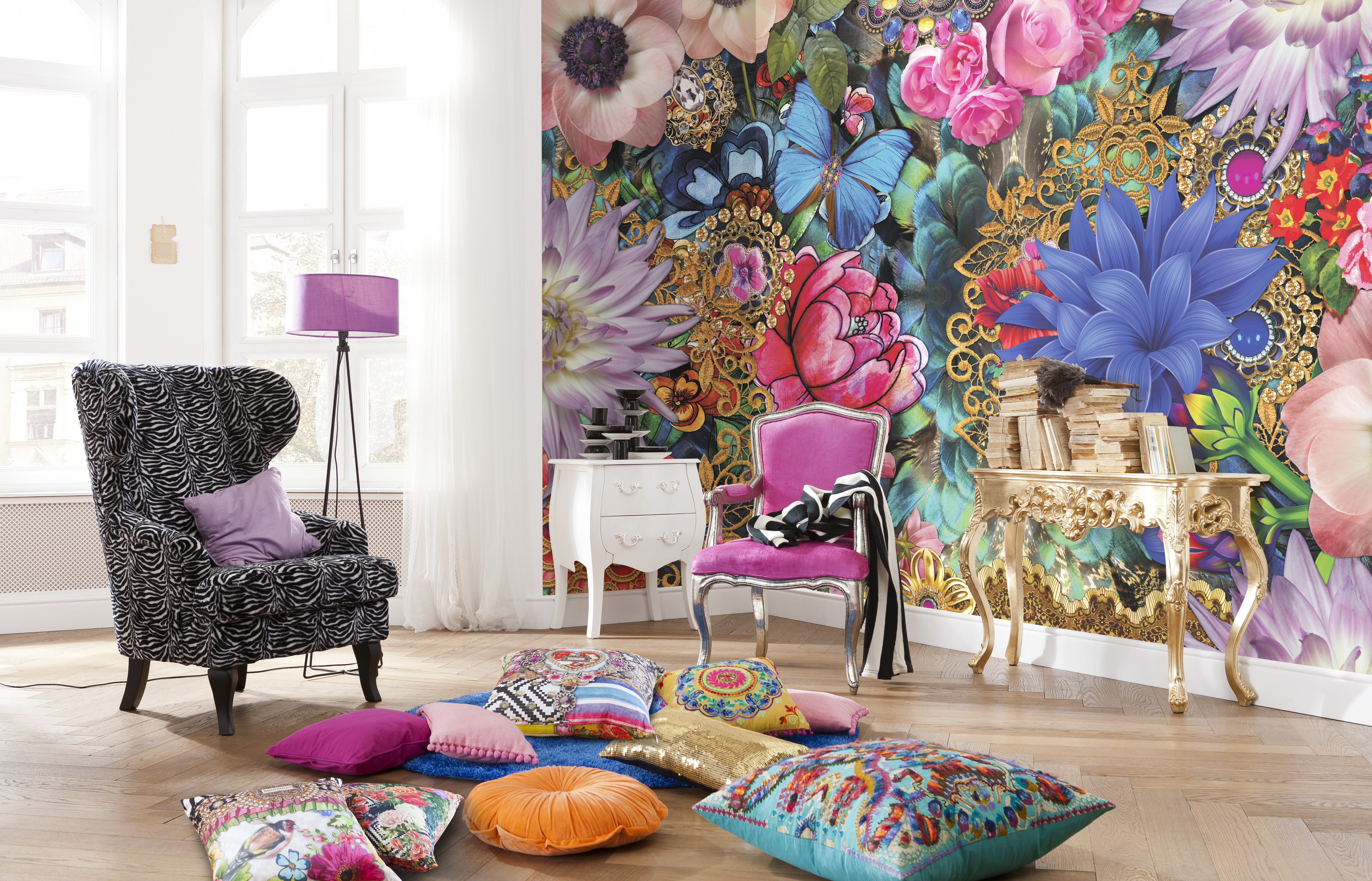
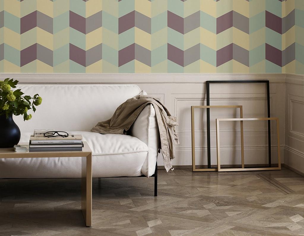
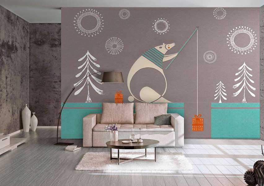
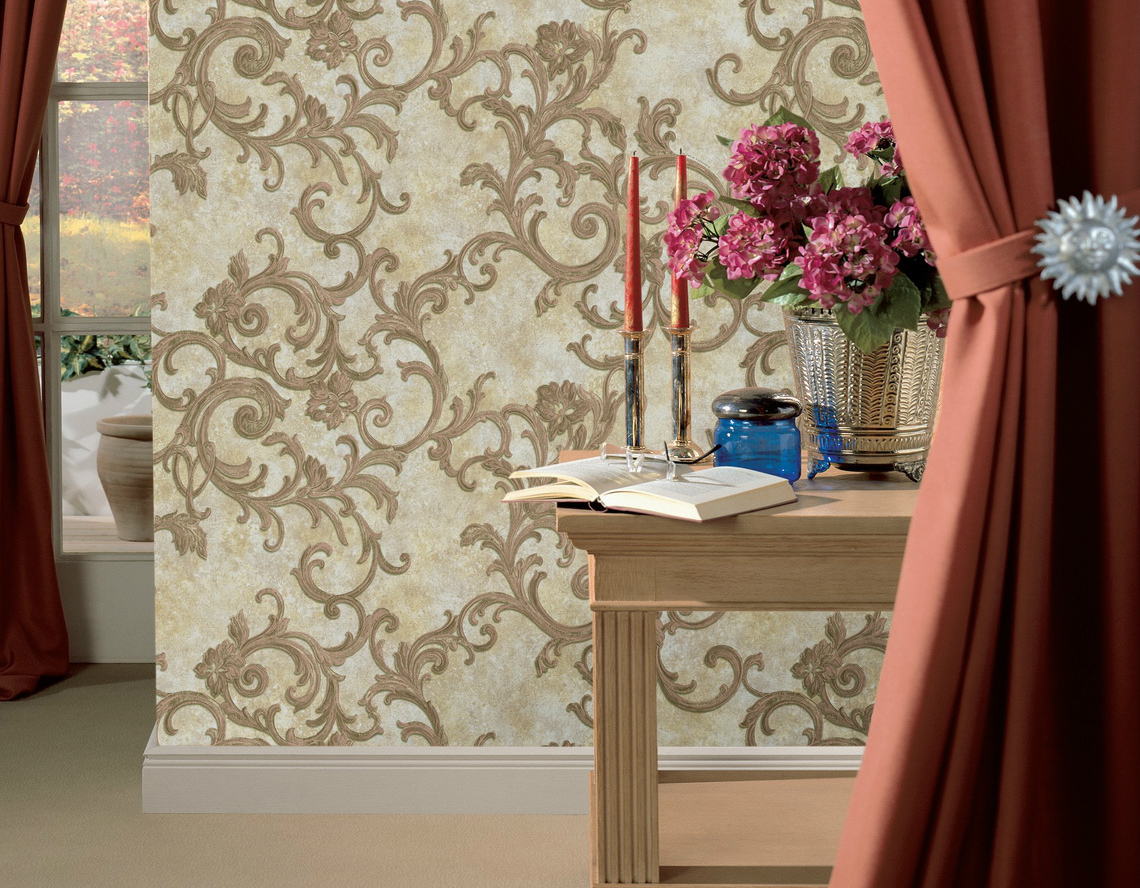
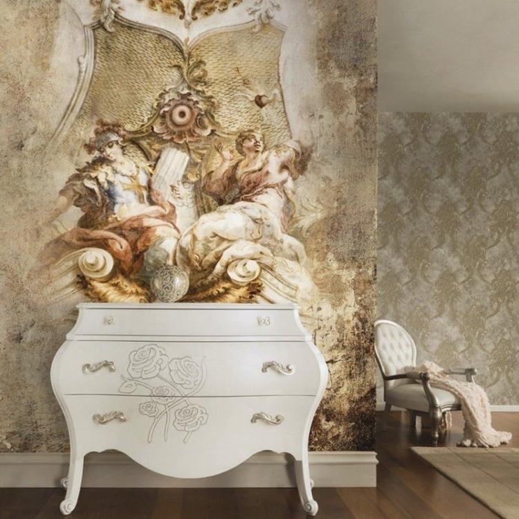
With a large picture
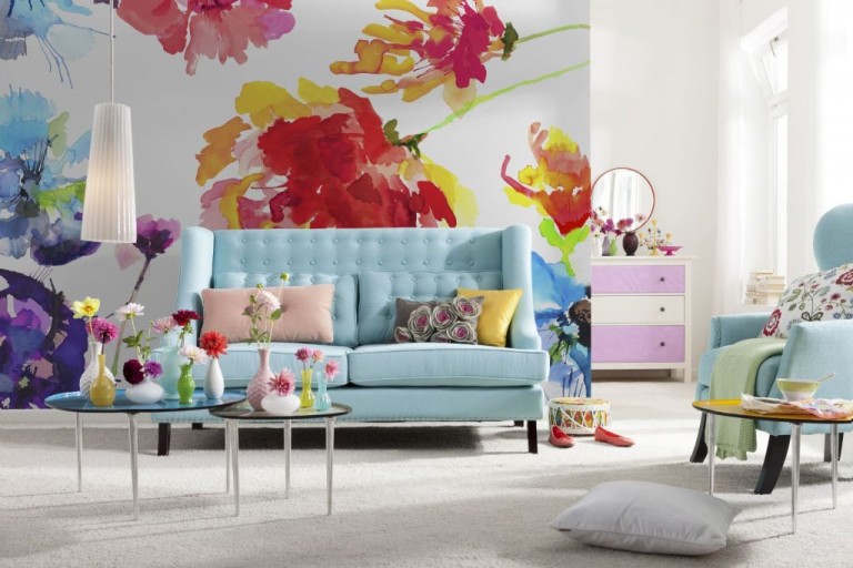
Contrary to well-established opinions, it is safe to say that a large picture will look great in a large and small room. It is important to choose the right option so that there is no unnecessary clutter and variegation. The more contrasts have shades with a large pattern, the better it will turn out to focus the attention of the guests on the wallpaper. This choice is best made for larger rooms that have an ample supply of natural light. And on the contrary, if the colors of the background and the pattern on it smoothly merge into each other or even merge, for a modest area this would be an excellent option.
The effect of wall tone on a person
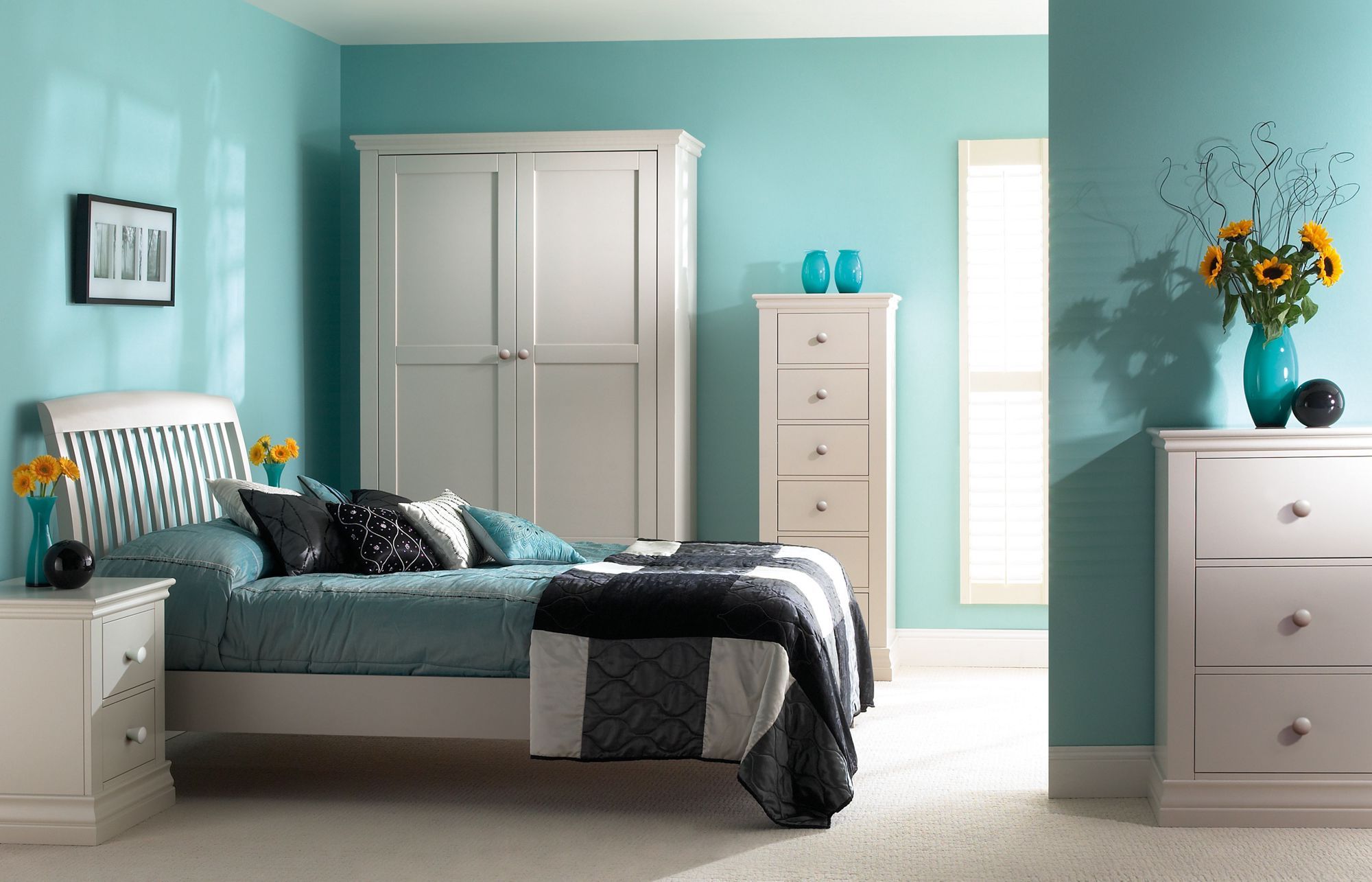
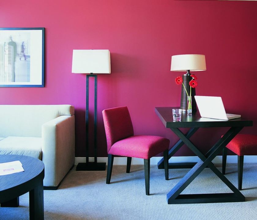
It is known that different colors in a certain way affect the mental organization of a person. It is believed that red has a stimulating effect, so it is not recommended for use in rooms intended for recreation. Red interior wallpaper and all their shades are well suited for the design of a study: this will contribute to enhancing the working mode and creating an optimal microclimate for productive activities.By the way, blue and blue colors are also good for pasting work space with such wallpapers, because they stimulate thought processes and help a person to concentrate well when performing important tasks.

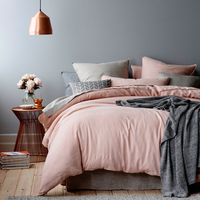
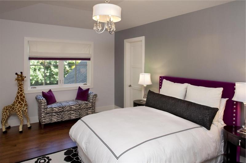
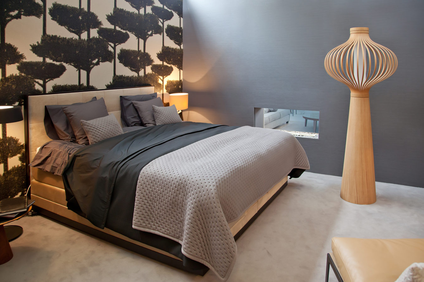
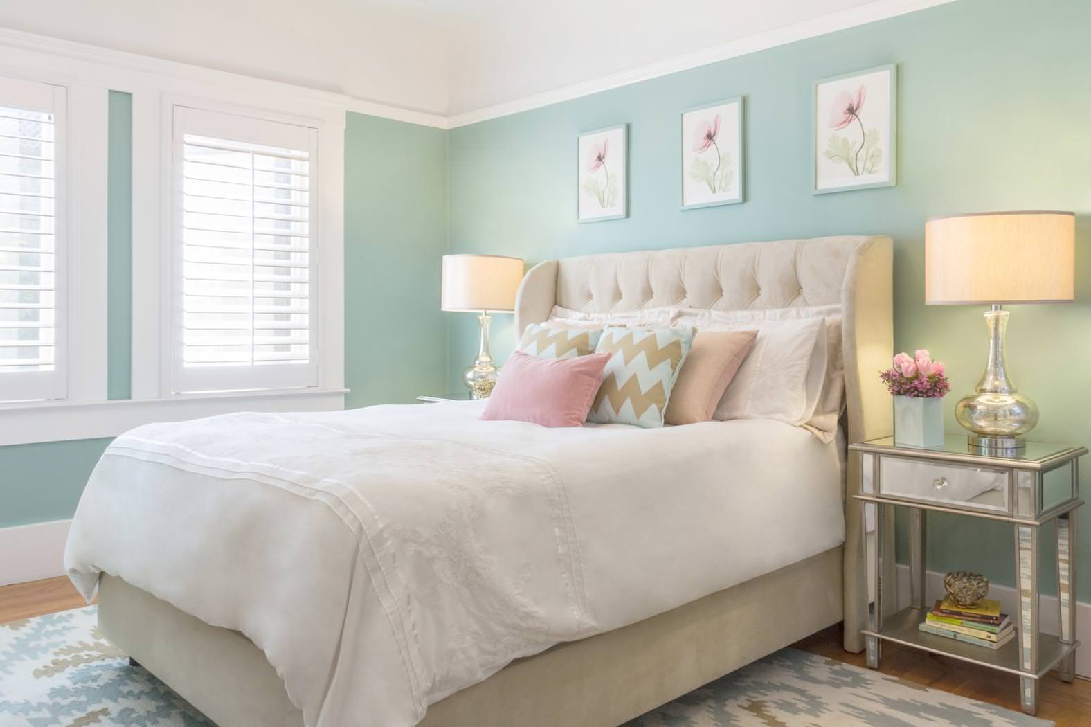
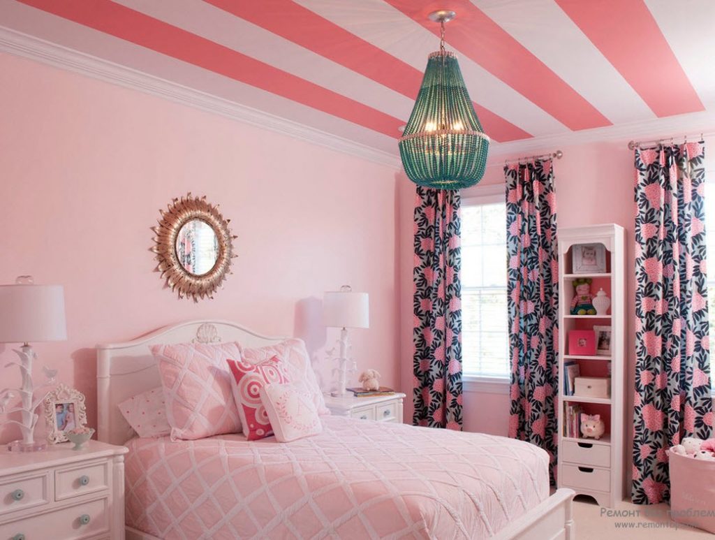
The bedroom is best to make muted and soothing tones: peach, pale blue, light purple, pink. This gamma promotes relaxation and restful sleep. Similar colors are recommended to be used in psychotherapeutic rooms, yoga centers and other rooms designed for a relaxing holiday.

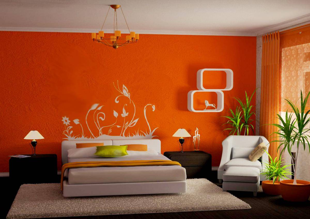
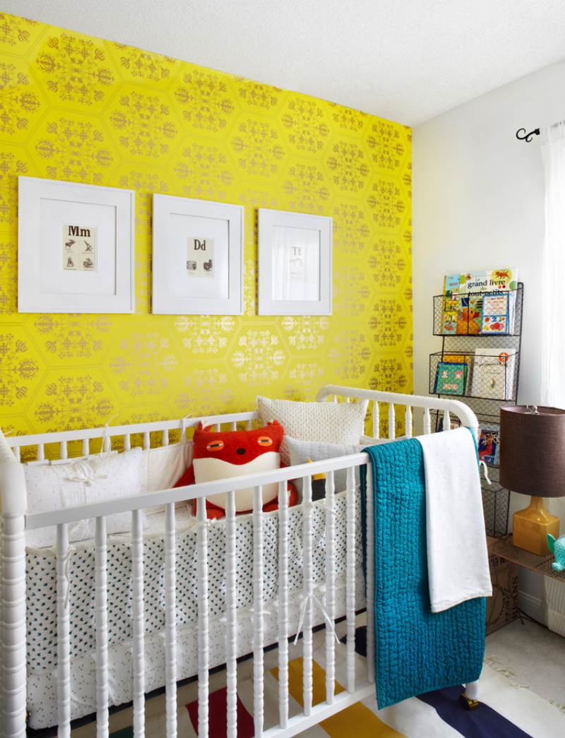
Joyful, bright yellow and orange tones are best suited for the decoration of the children's room: they are warm, contribute to the most favorable atmosphere in the nursery. In order to make the child more fun, you can even make zoning using different color wallpapers and patterns: for example, the area above the bed can be covered with wallpaper with the design that your child likes most, and let the rest of the space be decorated with models harmoniously combined with specially highlighted zone.
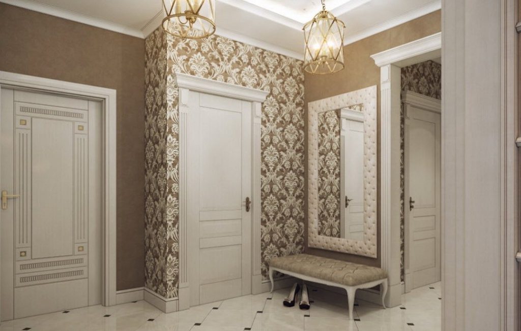
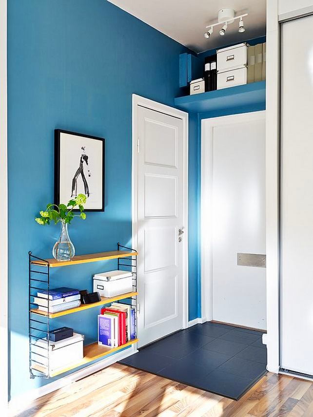
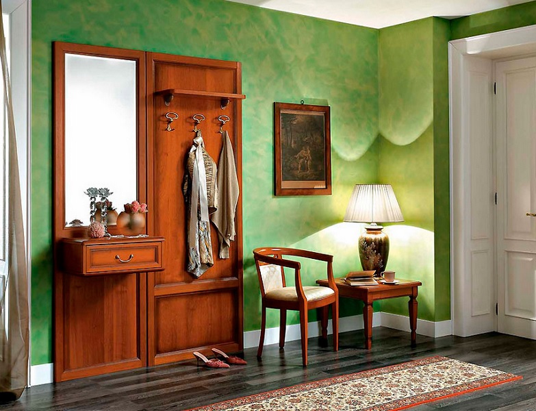
For the hallway, you can use all the options of dark colors of soothing shades: brown, blue,green These colors create a good microclimate and an atmosphere of comfort as soon as a person enters the room.
How to combine different shades and textures?
The combination in the interior of the wallpaper of different textures and colors is a very common and creative technique that allows you to show your creative abilities in the design of the room. Thus, the wallpaper of two types in the room can help emphasize its advantages, while hiding the disadvantages. For a person who decided to engage in a combination of different colors, it will be enough to learn a few simple principles of how to combine shades of a particular range.
If you pay more attention to the collections of the same manufacturer, it becomes clear that many decorative options (at least two or three) are ideally suited to one another. This is done specifically to ensure that consumers have the opportunity to combine different models in an original, contrasting and tasteful way.
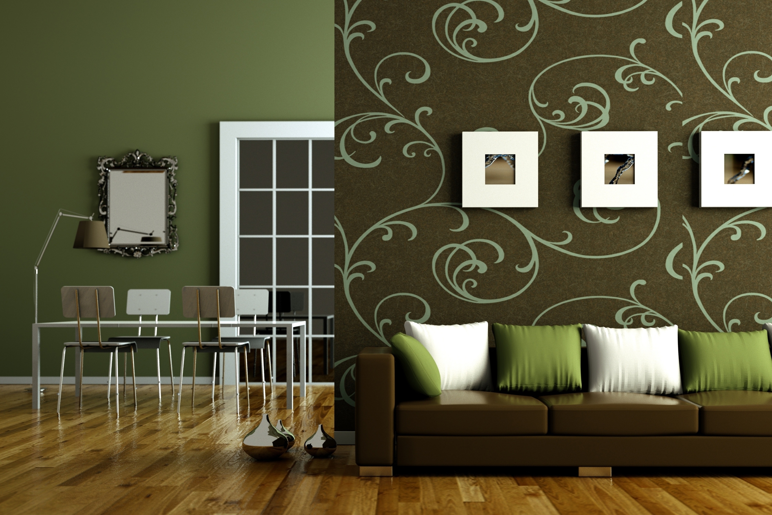
The combination of multi-colored models with each other is different. The simplest is expressed in the harmonious addition of one color to another.Complicated combination implies a combination of different color shades, and an extraordinary one - when the combination can use three colors that are radically different from each other.
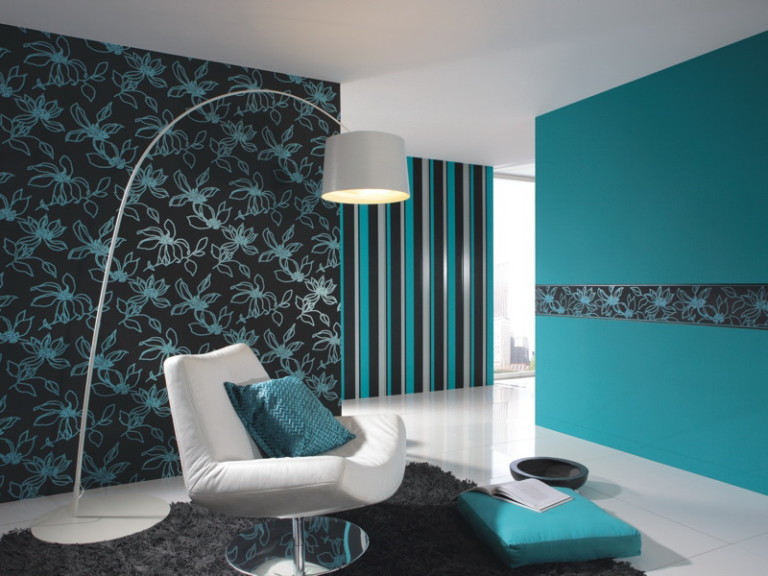
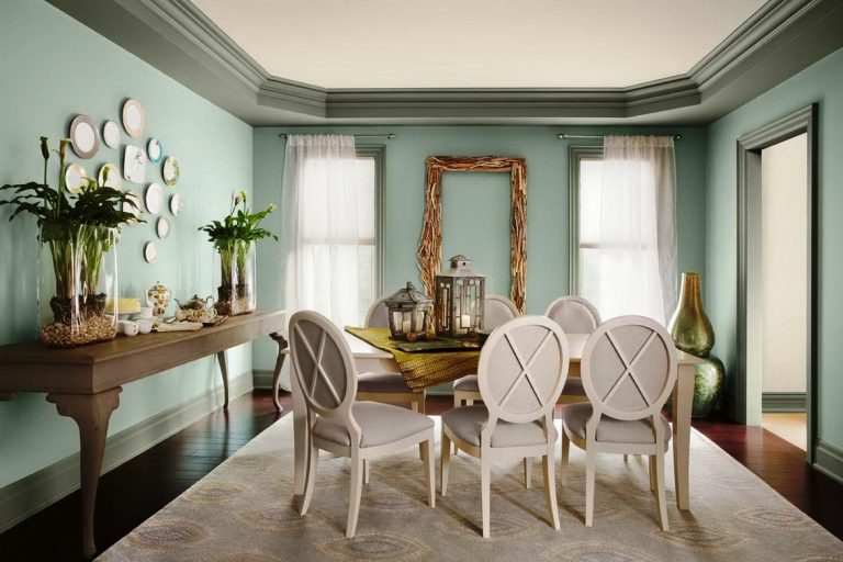
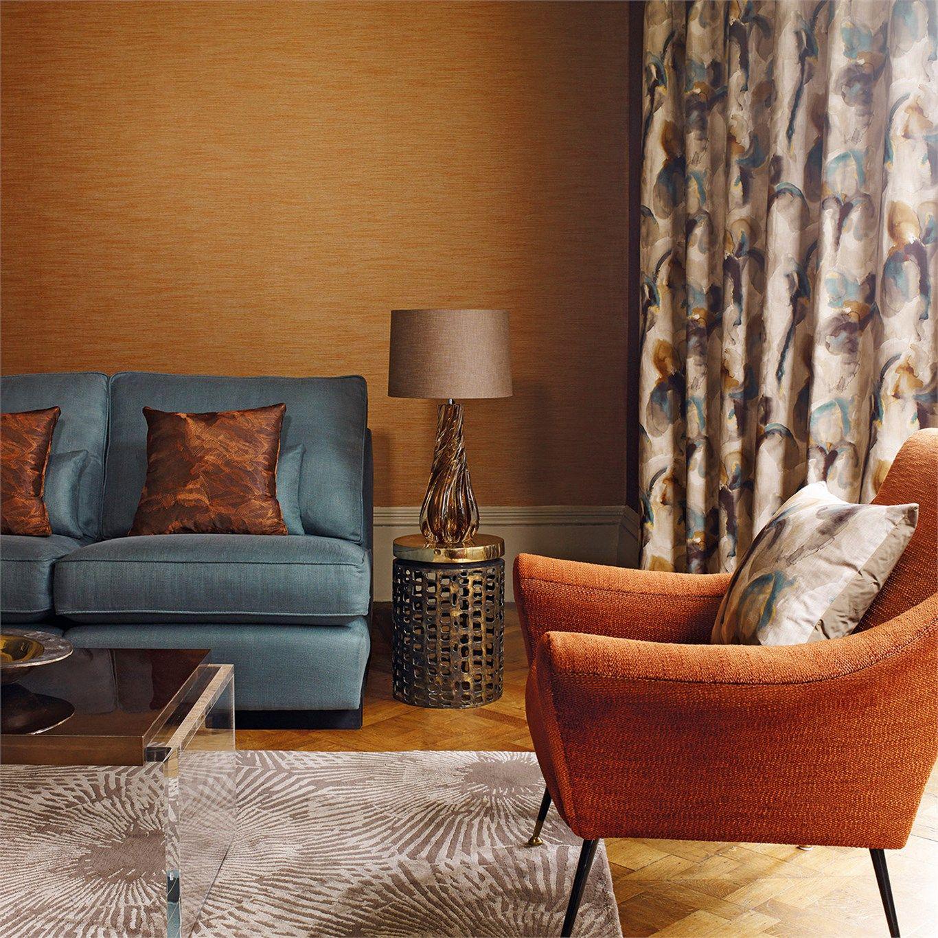
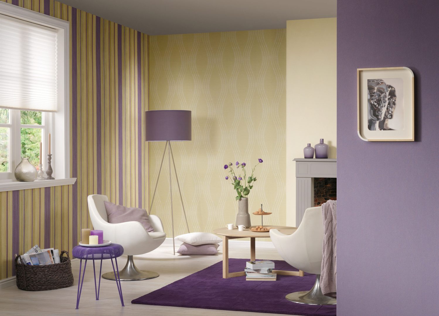
In general, in order for the interior to give the impression of comfort and tranquility, it is enough to combine three shades of the same spectrum, for example, pistachio, mint and lime. This combination is well suited for the bedroom. In a more lively room (living room or kitchen of a large size), you can safely combine opposite warm and cold colors: yellow with blue (purple) and blue with orange.
For a more difficult combination task, you should be aware that between different types of wallpaper must be present and the contrast, and the community at the same time. For example, models may be similar in color, but with a different shade (brown and chocolate). In this case, it is highly preferable that the drawing on them should have one style and structure, for example, in the form of large flowers on one form, and small flowers on another. If there is a desire to combine different patterns, for example, models with floral designs with options for polka dots or stripes, it is highly desirable that the main background, on which the patterns are located, be of the same color range.

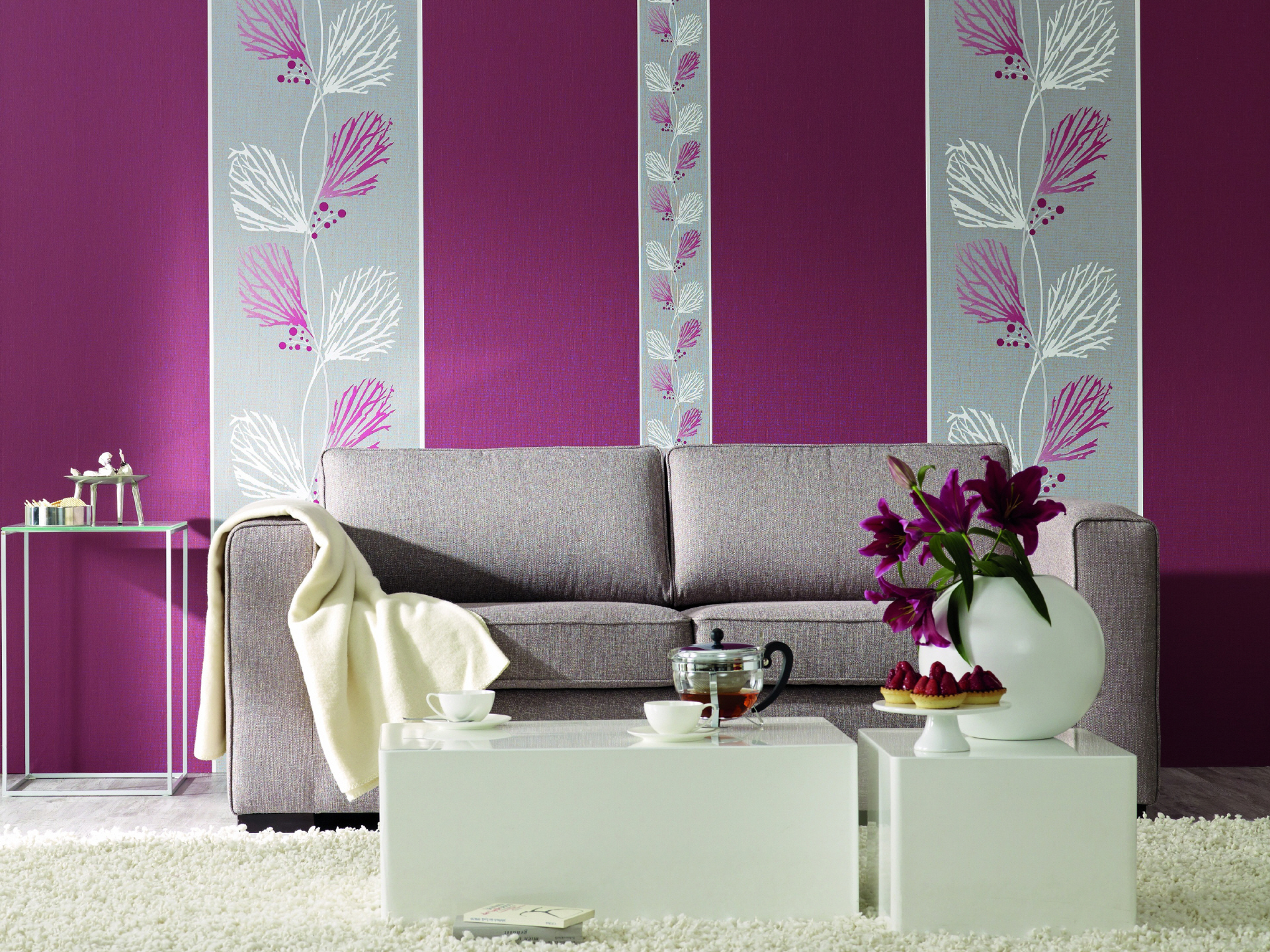
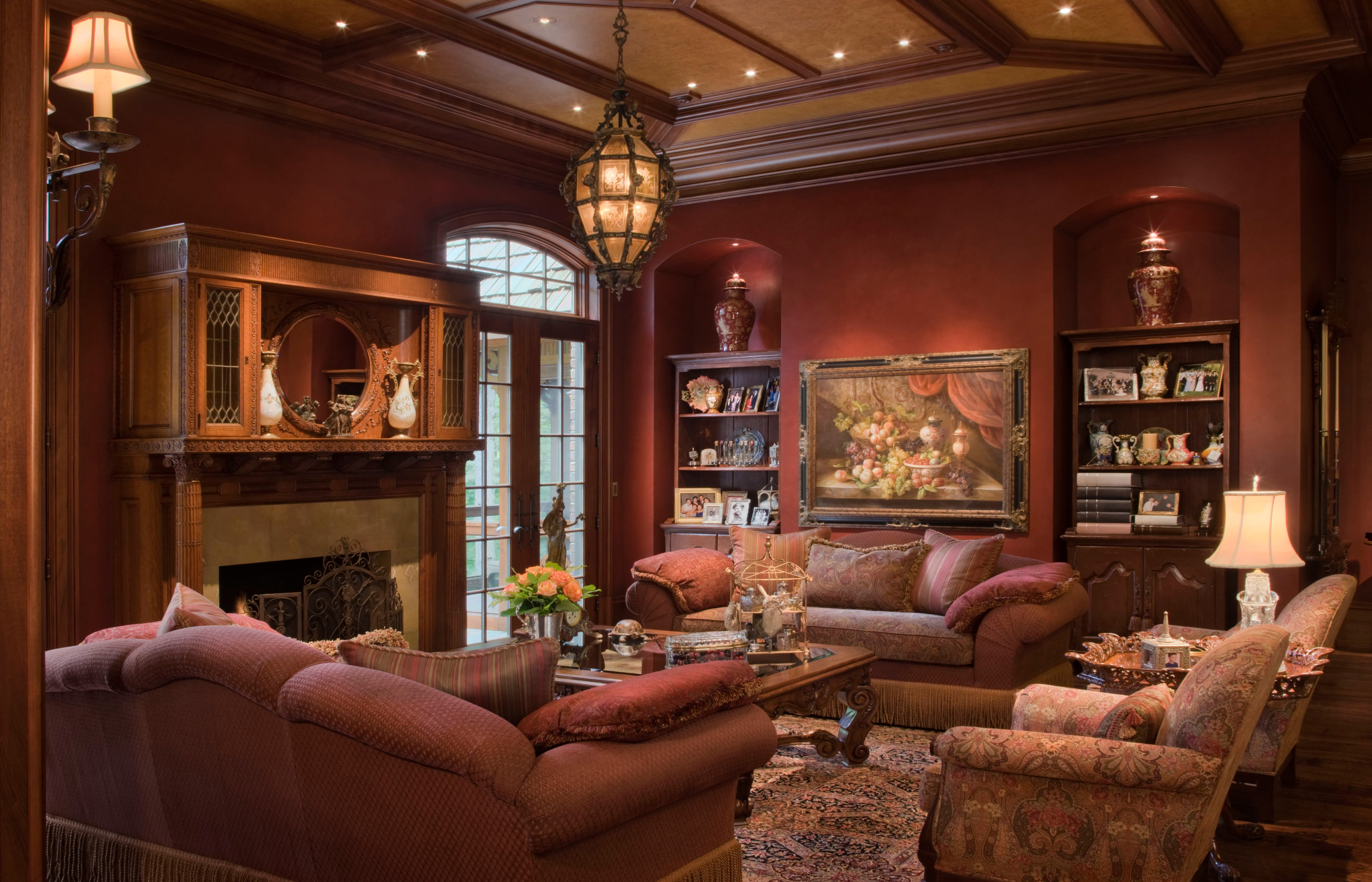
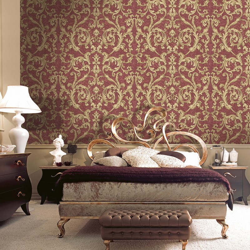
In the spacious living room to create an atmosphere of fullness and comfort will help thick and dark wallpaper (purple, dark silver and even black). You can safely choose options with a large pattern: it can be red poppies on a velvet-black background, maroon models with gold. In this case, it becomes much easier to choose furniture taking into account the color of the wallpaper, especially if the living room is planned to be decorated in a solid classical style. Wallpapers of thick and dark colors and shades are harmoniously combined with velvet curtains and tapestries, and it is better to select places for furniture to be placed with solid models of colors that are calm and suitable for it.


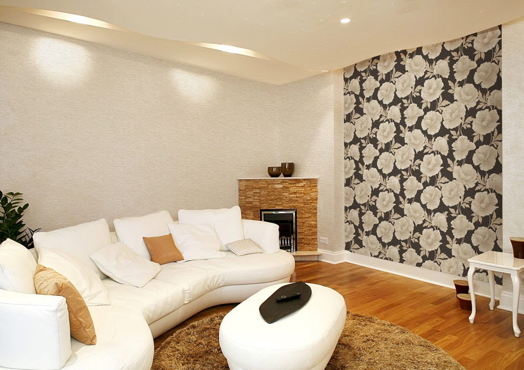
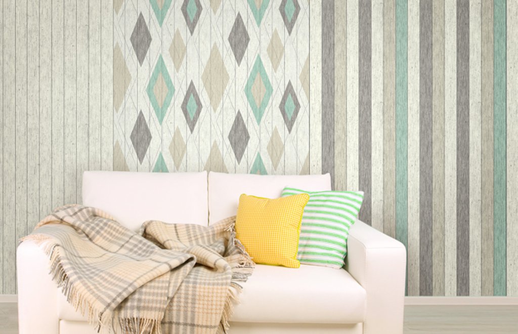
As already mentioned, dark models and too large contrasts when combined will not be suitable for small rooms, the space of which requires visual expansion. A good way out of this situation may be the design of one wall with light wallpaper, while the drawing should not be too obvious, but have a clear texture. The remaining walls can be pasted over with wallpaper of another type, while large geometric variants should not be used in a limited space in order to avoid the appearance of disharmonious clutter effect.However, you can use the image of a small rhombus on a monochromatic soft background - this is the only figure that has an elongated shape that is most appropriate in a room with more than modest footage.
Uneven walls, of course, cause residents a lot of trouble, but they can be the reason for a creative approach to the design. The saving anchor here will always be non-woven wallpaper that has excellent leveling ability and is designed specifically for this purpose. The surface of the wall should be pre-aligned as much as possible, in order to try to hide the defects as much as possible, and only then proceed with the gluing.
To hide the irregularities suitable small peas, models in a tartan cell, and even spotty prints - the design is selected depending on the level of the defect walls. Of course, a contrasting combination of different colors (yellow and red, blue and orange) will be most preferable due to the fact that they skillfully distract the gaze from the defects themselves with their brightness and variegation. The rest of the space can be pasted over with ordinary paper wallpapers, but the main thing is that they are not too thin and cheap, and the basic tone and direction of the pattern in style should correspond to the “main” wall.

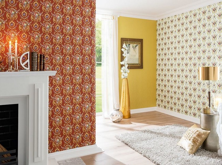
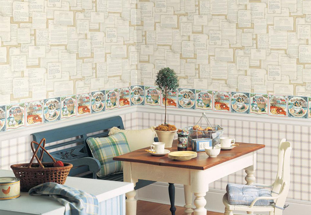
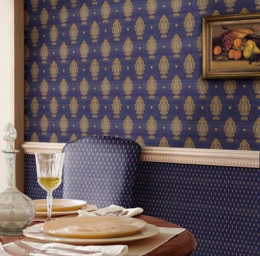
If someone is fortunate enough to become the owner of a kitchen with a high ceiling and large windows, it is important to ensure that it does not look like a cold and stately room. You can create coziness in it by applying two types of wallpaper from the same manufacturer, matching each other in color. The lower half of the wall should be pasted over with a model of a darker color, and the upper one (it should be much smaller) - in light colors. Optimally - divide the boundaries between the combined zones with the help of a curb that visually makes the ceiling a little lower. The combination of colors recommended by professionals: the top is dull-pink, and the bottom is red, the top is sandy, and the bottom is dark golden, and so on.
If the room is very elongated and seems very long and narrow, the combination of two colors with different patterns will help smooth the feel of the tunnel. A short wall is pasted over with a model with a pattern that is horizontal, and let long walls be decorated with wallpaper with large images of dark tones (flowers, patterns, simple geometric shapes of blue, burgundy or saturated gray).


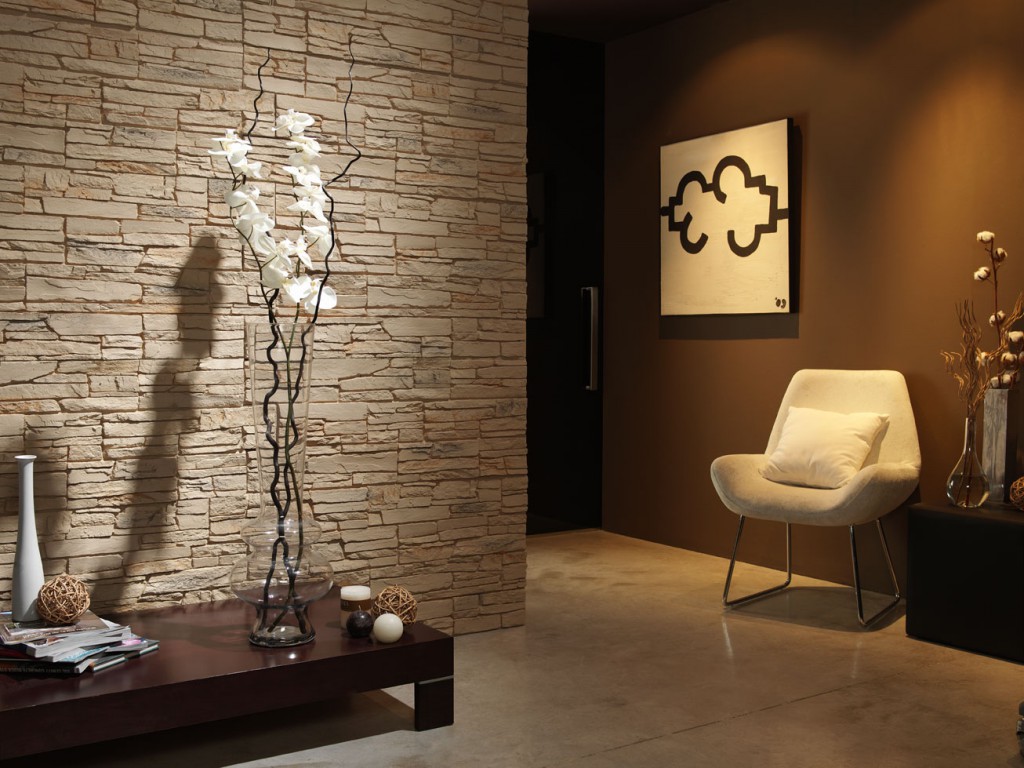
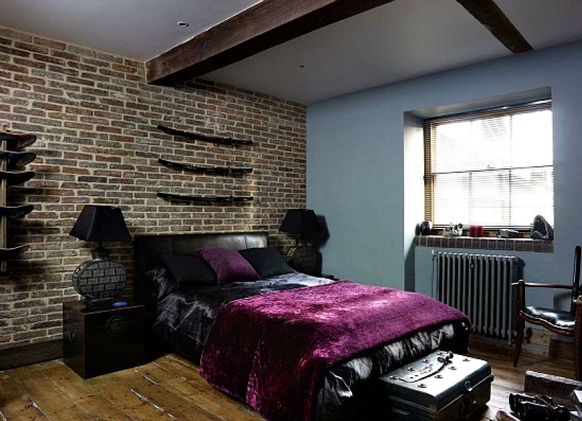
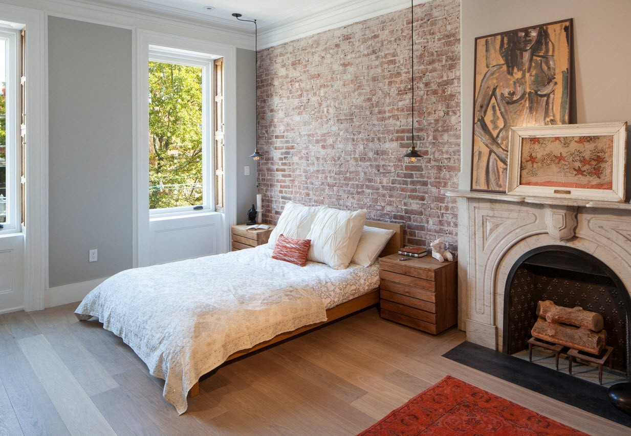
Wallpaper and brick
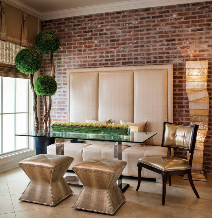
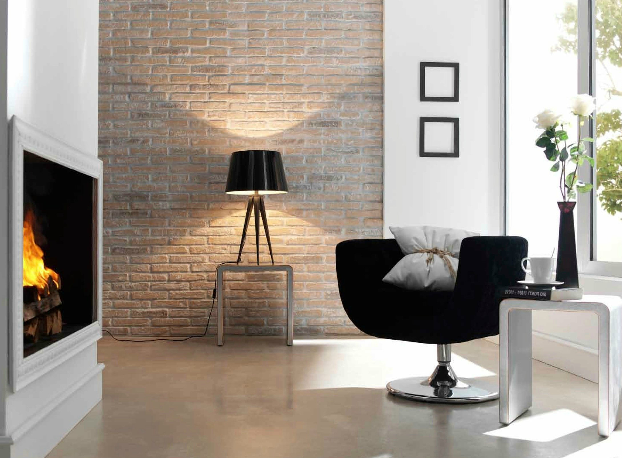
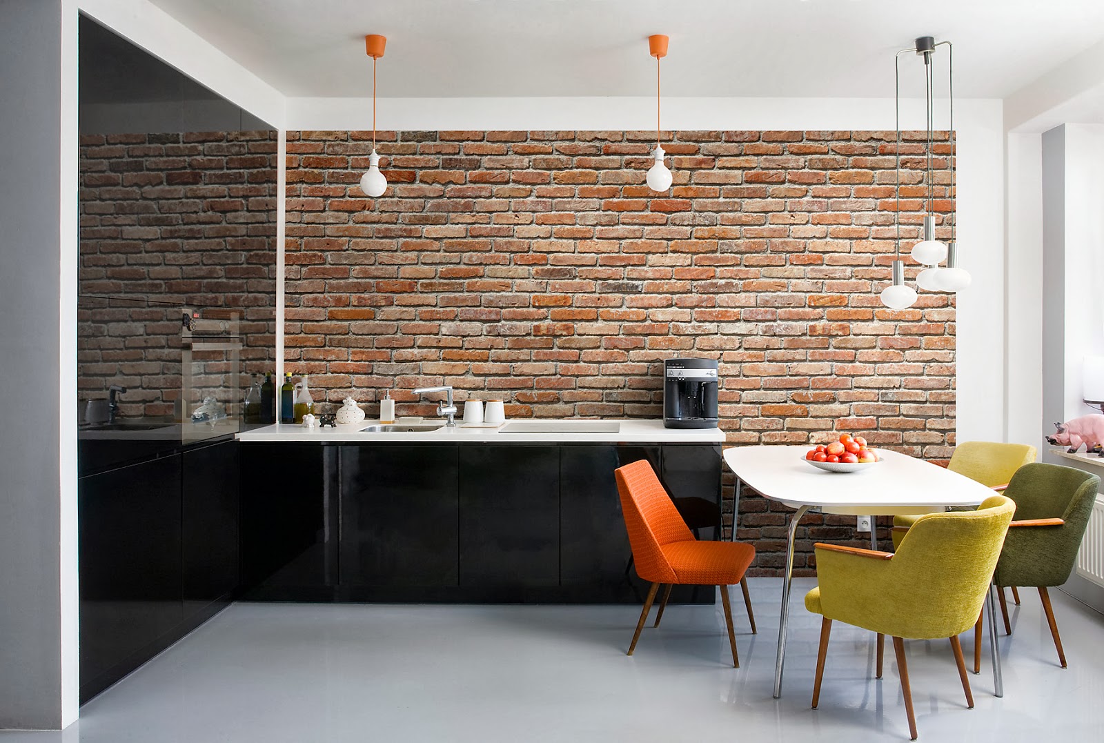
The presence of bricks in the interior space firmly formed the basis for arranging the interiors of a wide variety of rooms: from living rooms to numerous art spaces, cafes and small restaurants where such decoration can be found most often. If there is a desire to arrange home comfort in this way, nothing will prevent the combination of brick and wall wallpaper between them so that the space looks more vivid.
As a rule, walls that have a brick finish or the use of real brick without finishing find their sympathy among young people who prefer the most advanced and modern interior options such as grunge and loft. If the living space in this case is not covered with wallpaper in general, it will look cold and uncomfortable, even if the color of the brick itself is orange or red. Partial sticking of the walls is usually used to symmetrically designate the main areas of the room, as well as to hide the construction flaws in places where the brick may not look quite “presentable” and neat.

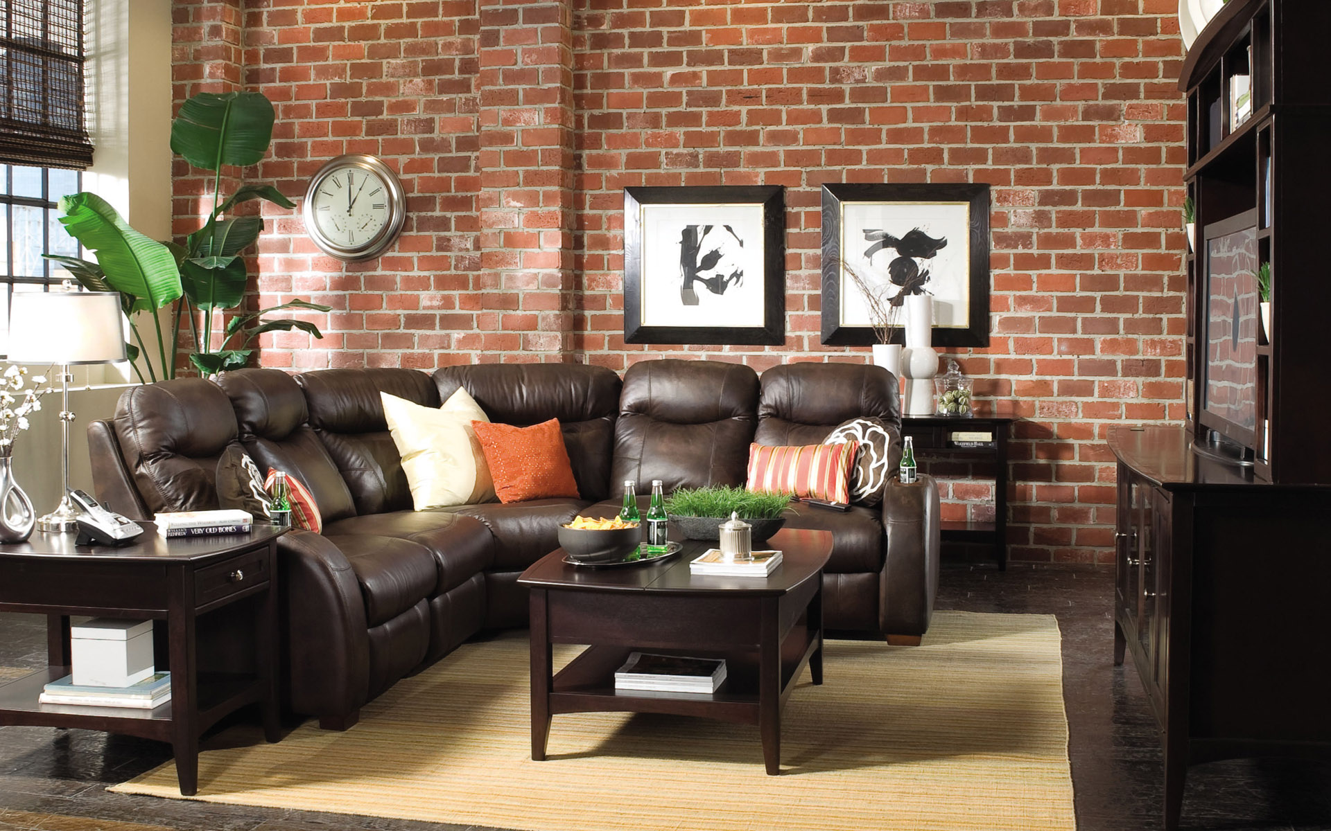
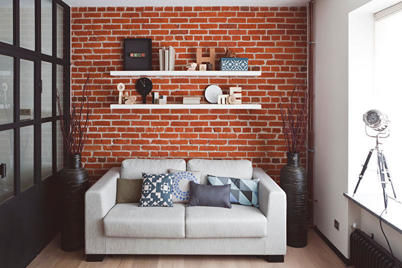
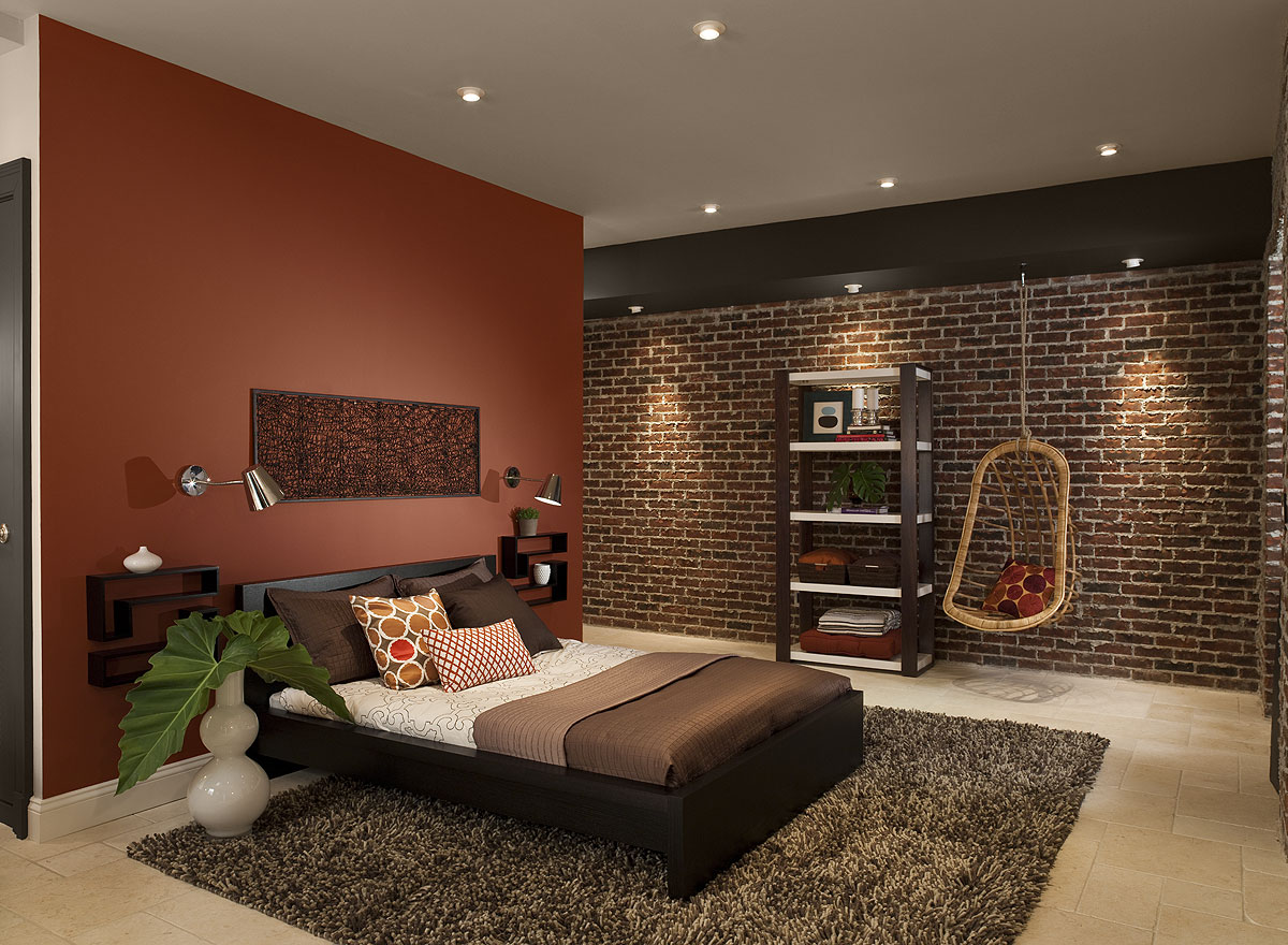
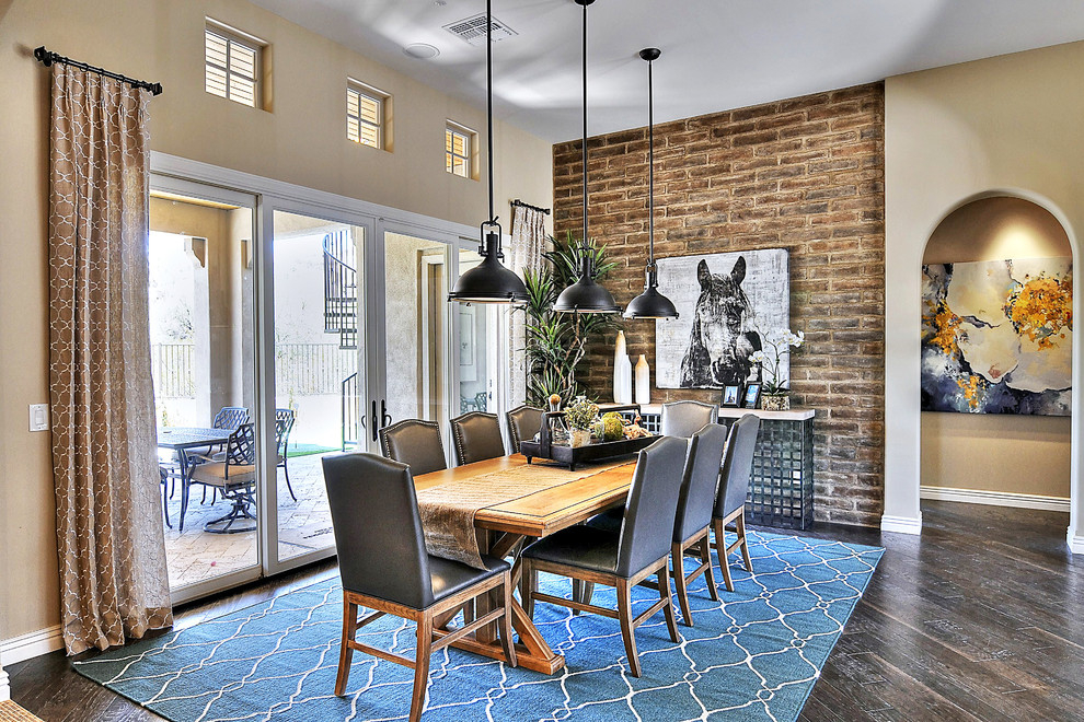
Of course, the question of color combination and here occupies a special place.It would seem that it is very simple to choose wallpaper to the wall of orange or red color: you can simply paste over the walls with canvases of similar colors. However, it is necessary to warn you in advance against such an error. If there is a red or orange brick in the room, then similar shades just should not be allowed: they will merge with each other, and the possibility of an advantageous combination of wallpaper and brick will be lost. It is best to choose the opposite colors, preferably without pronounced patterns, to avoid unnecessary clutter of lines and variegation: dark blue, soft green, also dark shades. If the bricks are gray, it is much easier to choose the color: just here you can give preference to bright colors, “diluting” the twilight gray.


You should not get involved in the creation of a shapeless "picture", using when pasting "pieces" or parts of different wallpaper. The fact that a brick wall is universal and easy to create a design seems only at first glance. Before you set yourself such a task, you should choose the most suitable and successful example for yourself that can be followed in the future.
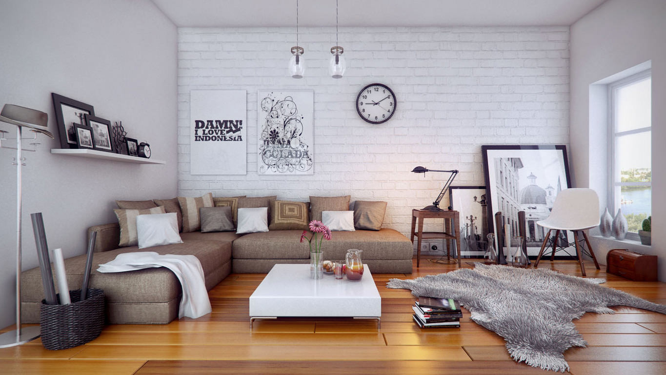
The presence of photo wallpapers is also not recommended: they will create an unnecessary effect of congested space. It is important to remember that discreet monochromatic models here will fit most and will favorably emphasize the “pristine” and original brick walls. If you wish, you can paint the brick walls with white paint - this can be especially relevant if an insufficient amount of light penetrates the room.
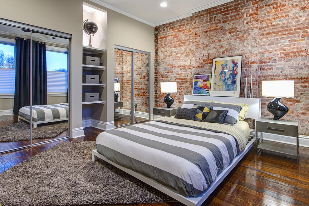
Brick print
It is known that not everybody gets a room with a picturesque wall of natural brick. In addition, in order for such walls to look beautiful, sometimes you have to put a lot of effort - starting with finishing and finishing with the selection of wallpaper, which was discussed above. As for the wallpaper with imitation brickwork, anyone can buy them and paste over their space as they see fit. In this case, do not forget about what colors should be used in a particular case.
Most often, this option is used to highlight certain areas.: fireplace or work area in the kitchen. Since the “brick” models of wallpaper also come in different colors, to highlight the most popular zones, it is better to use light colors: white, beige, peach or light brown.Of course, in the kitchen it would be preferable to glue a more neutral color so that the spots and splashes are not so visible on it. By the way, dense vinyl wallpaper is easy to remove dirt, as well as washable counterparts.
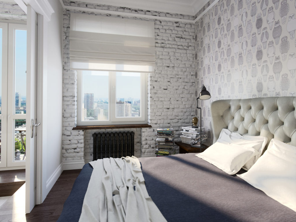
It is believed that such wallpaper is best to glue the hallway or kitchen, but this is not entirely true. With a variety of modern textures and colors wallpaper under the brick will look great in the bedroom, if they also tastefully select the area above the bed. The tone can be soft brown or light. There are also white wallpapers on sale that will skillfully create an imitation of painted brick and will look especially attractive in places for a relaxing holiday.
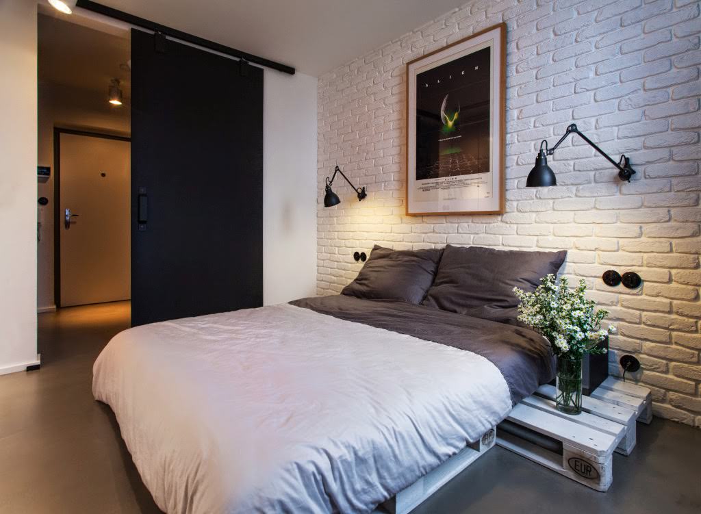
And finally, the main advantage of such models is that, unlike the real brickwork, they do not create a feeling of cold and punishment, but, on the contrary, radiate warmth and comfort.
Modern collections of Russian designers
Probably, few people know that the famous Russian designer Valentin Yudashkin recently embodied his ideas in different models of wallpaper. The fashion house of Valentin Yudashkin is located in Moscow and in addition to clothing, it develops wonderful home furnishings and household items.A new collection of wallpapers deserves special attention, in which the uniqueness is surprisingly combined with proximity to the Russian consumer.
The line “Home Fashion” was developed together with the Italian colleagues, the factory for the production of wallpaper Emiliana Parati, and reached the general public in 2014. Modest colors and classic patterns received a new frame in imitation of “semi-antique” embroidery, luxurious lace and drawings made in watercolor technique. To this were added notes of modernity in the form of holograms and the effects of three-dimensional space. The color scheme is modest, completely devoid of pretentiousness: from pale violet to dark gray, closer to black, with different variants of prints and patterns.
The second collection was published in 2015 and was named the author of “My Italian Journey”. Each type of wallpaper in it represents an Italian city or island: "Rome", "Venice", "Sicily", "Florence". They contain skillful imitations of traditional Venetian stucco, Roman classical severity, Florentine creative flight, the romantic spirit of Venice. All this is perfectly conveyed by the author in collaboration with Italian designers and finds a wide response among Russian consumers.Moreover, the cost of the first collection of wallpapers from Valentin Yudashkin became much lower after the release of the second.
Fashion designer Vyacheslav Zaitsev is not far behind his colleague. If Valentin Yudashkin already has two recognized collections, then the debut wallpaper from Vyacheslav Zaitsev made a splash and public recognition at the exhibition in Moscow recently - in 2017. If you carefully look through all the copies of the collection, it becomes clearly visible that the author prefers a harmonious combination of white, black and red colors, skillfully harmonizing them with each other in a rich palette of traditional patterns and monograms. This is what sets a special mood coming from each model: such a color combination is deliberately devoid of serious competition, if we are talking about modesty, restraint and subtle taste.

The predominant color in the collection of wallpaper Vyacheslav Zaitsev is always exactly white. This is partly why his wallpaper, despite their novelty, is almost always recognizable by those who are constantly interested in domestic interior novelties. It is noteworthy that each type of wallpaper is a high-quality imitation of such expensive fabrics as silk, satin and velvet.This creates an atmosphere of attractiveness and harmony, without which it can not do in the home space.
When choosing wallpaper, the designer advises people not to follow common prejudices about black: because if the wallpaper has a nice silk gloss, it adds to the “blackness” of softness, lightness and elegance. Any colors should reflect the inner world and mood of a person, and this applies not only to clothing and furniture, but also to wall-paper, which often sets the basic tone of the internal space of a house.
Thus, when choosing a color palette of wallpaper can be guided by generally accepted advice from designers and well-known fashion designers. However, any process of creation is creative, and your own ideas can also organically fit into the concept of good taste, if you approach everything thoroughly, focusing on the observance of some simple standards.
On the new trends in interior design with wallpaper and curtains will find out in the next video.


