Azori tile: characteristics and design
Italian ceramics is considered the best in the world. Many people dream of decorating a bathroom with such material, but the price painfully bites. And it was even more pleasant for the buyer to have the Azori ceramic tile on the market from a domestic manufacturer working in close cooperation with Italian specialists.
Special features
The Azori trademark was created by the KeraMir group of companies, which began its journey more than 10 years ago and has been actively developing ever since. This group includes two production units: plants of CJSC KSP and CJSC Dekor-M and its own logistics network.
Both plants are equipped with the latest Italian equipment. "KSP" is responsible for the manufacture of wall and floor tiles, and "Decor-M" complements the collection of decorative components (borders, decors).The first Azori brand products appeared in 2006, and quickly took a leading position among Russian manufacturers of ceramic tiles. Buyers immediately appreciated the combination of price, design and quality.
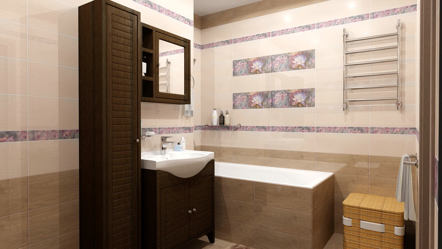
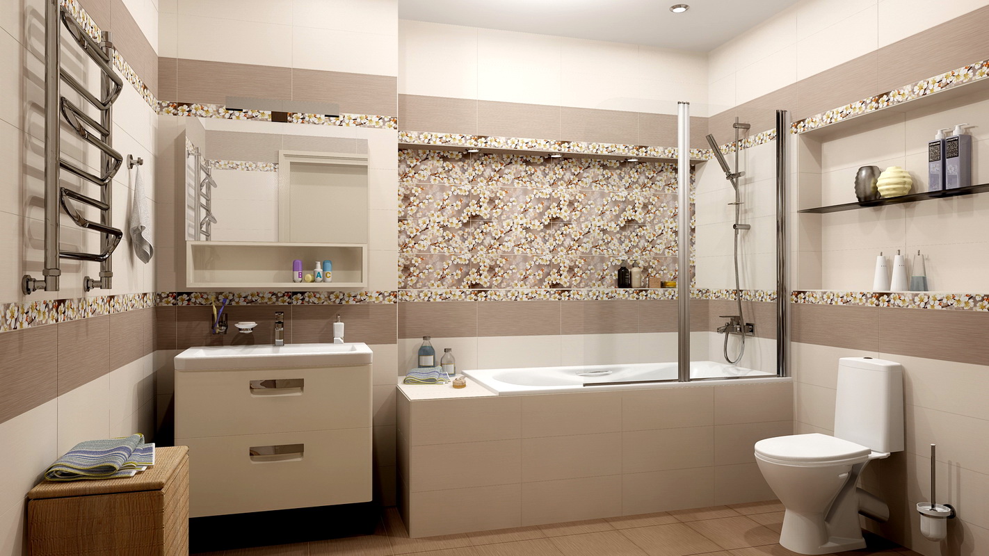
Product design "KeraMir" captivates with a wealth of colors and surfaces. Each new series is a reflection of fashion trends such as imitation of patterns and surfaces of natural materials, floral motifs, abstraction and strict geometric lines. Both Italian design studios and young talents from Russia are participating in the development of new decors.
"KeraMir" is used in the manufacture of decors, water-jet cutting technology (hydrojet). Using a water jet with an abrasive in the tile cut out the recess for the decorative insert. Similar decorations were found only in expensive imported collections, and now they have become available to the average consumer.
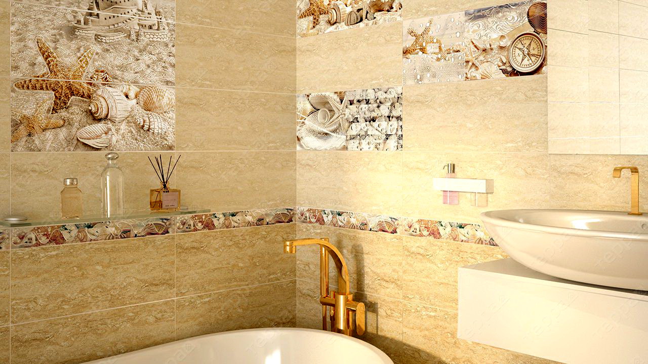
The pattern on the Azori tile is mainly applied with the help of the “Rotokolor” system, which almost supplanted the classical flat screen printing method. Some series are decorated with digital printing.
Specifications
All brand products (floor and wall) are manufactured according to statestandards.
It has the following characteristics:
- Thickness, depending on the size - 7-9 mm.
- The ability to absorb water from a tile for walls - up to 24%, for a floor - 4.5%.
- The deviation of the form of tiles (curvature) is not more than 1 mm for wall. For floor tiles, this figure does not exceed one and a half millimeters.
- Deviation of sizes is possible from 0.5 to 1.5 mm.
- Heat resistance - up to 125 C for samples with colored glaze and up to 150 C - with white.
- Resistant to chemical attack, however, during the care it is desirable to avoid acid-based products that can damage the top layer of glaze and decorative elements. Soap, based on organic fats, is also not suitable for ceramics, as it provokes the development of mold due to the fatty film and reduces the gloss of the tile.
- Resistance to mechanical damage conditional. The systematic use of abrasives or metal brushes definitely damage the surface, which will be especially noticeable on glossy tiles.
- Class I wear resistance. This indicates the possibility of its use only in low-traffic areas.
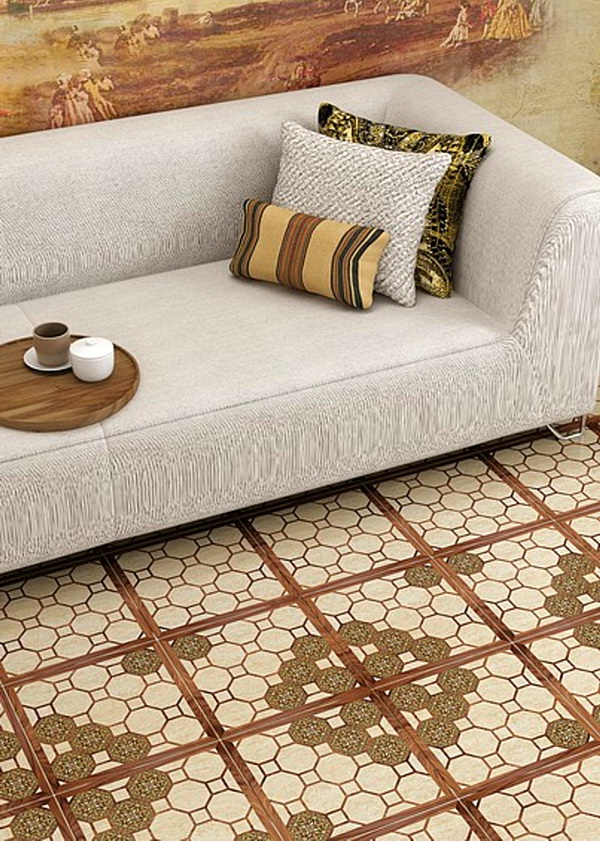
Collections
Azori catalog amazes with its variety of colors, textures and decors.Every year the company's range is replenished with a new series, or even a few. At the moment there are fifteen. The series “Inspiration of colors”, released in 2006, became debut. It consists of 4 collections: "Alize", "The Beast", "Aurora" and "Caprice", gathered in themselves all the colors of the rainbow:
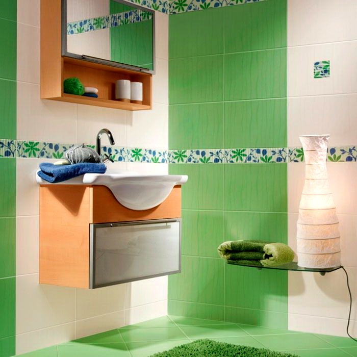
- "Alize" - tile line with embossed texture and pattern in the form of vertical stripes. As a decor, buyers are offered rare floral inserts and the same curb.
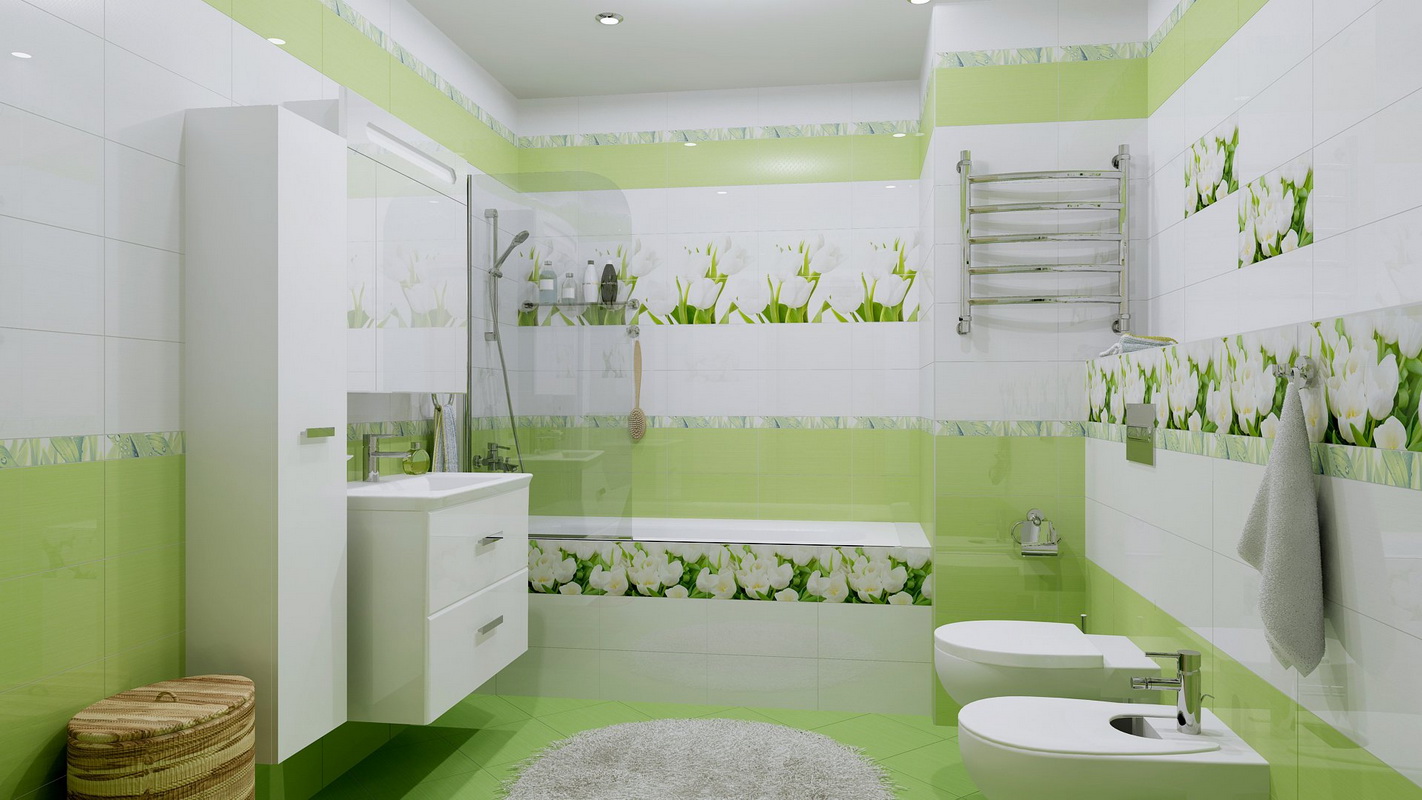
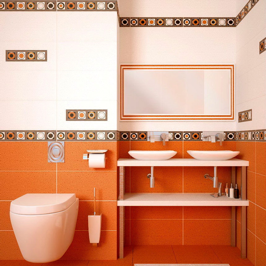
- In "The Beast" designers have focused on the decor in the form of large tulips. The colors are orange, blue, green and brown.
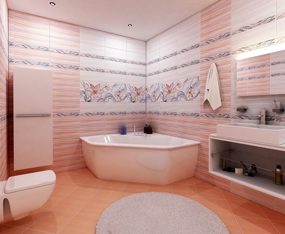
- For Aurora warm tones of rich orange, blue and brown are characteristic, and all this is decorated with interlacing of plant ornaments with coffee beans.
- "Caprice" - This is an abstract fantasy on the theme of movement. Smooth, curving lines flow into one another, creating a feeling of infinity. This decor will appeal to lovers of concise designs.

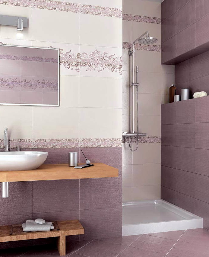
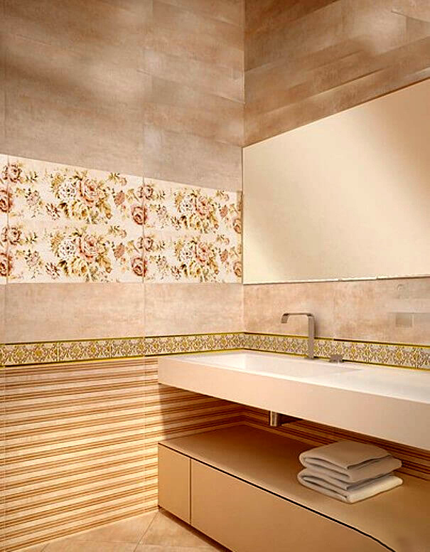
The following year, he enriched the range with the Harmony of Beauty series, which included the Origami, Radika, Karpet and Travertino collections. The series is a collection of shades of brown: from light to dark.She is the epitome of classics, tranquility, harmony, and slightly brings sadness.
Brown melancholy changed bright colors. The series "Mood colors" includes the line: "Jasmine", "Tweed", "Fusion", "Crystal":
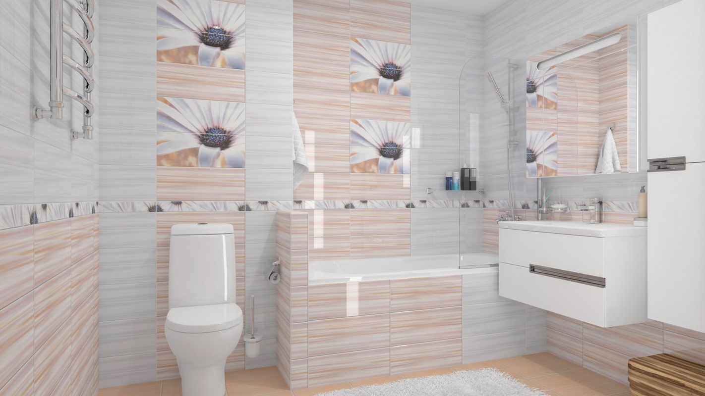
- "Jasmine" reminiscent of summer thanks to rich shades and floral patterns.
- "Tweed", as the name implies, is an imitation of a popular fabric. This collection has perhaps the most intense colors of the series: burgundy and orange, which are designed to balance the inserts that imitate tapestries.
- "Fusion" entices with intricate monochrome ornamentation on light and color elements. The accents are made up of multicolored borders and a round insert of individual light tiles.
Researches of 2009 presented the series “Magic of colors” with collections: “Alta”, “Iris”, “Twist” and “Atrium”. The paints used are deep, but calm and relaxing. The styles are different: here are the floral motifs of the Iris, and the textured patterns of the Atrium, and the strict geometry of the Twist.
The patterned series of 2010 is called “Inspiration in a pattern”. It consists of 10 options, so different in color and style, but nonetheless fascinating:
- "Asti" - laconic straight lines, diluted with geometric and plant patterns.
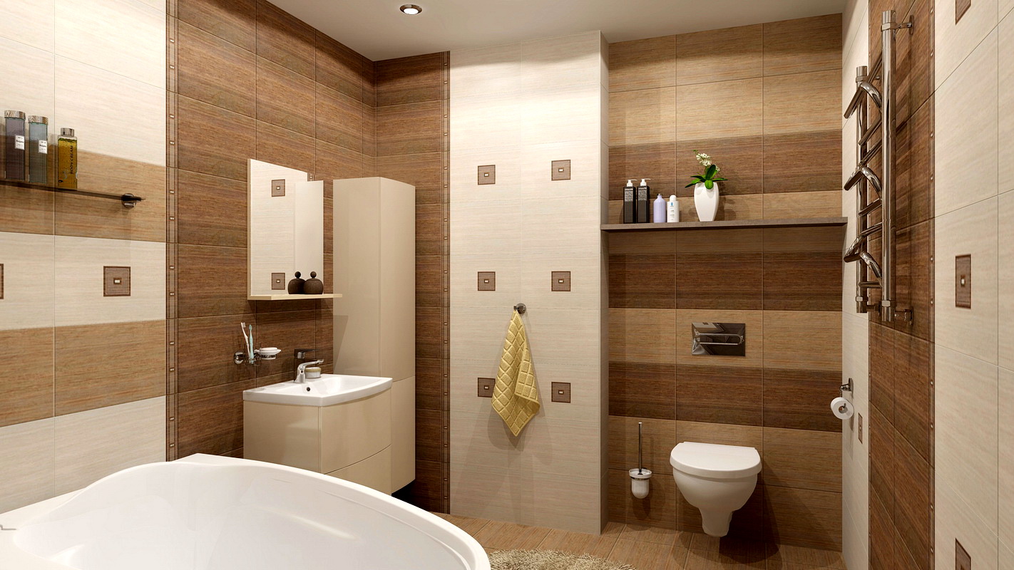
- Estella - natural shades, matte surface, imitating wood and decors in the form of flowering apple trees and bonsai resemble a Japanese garden.
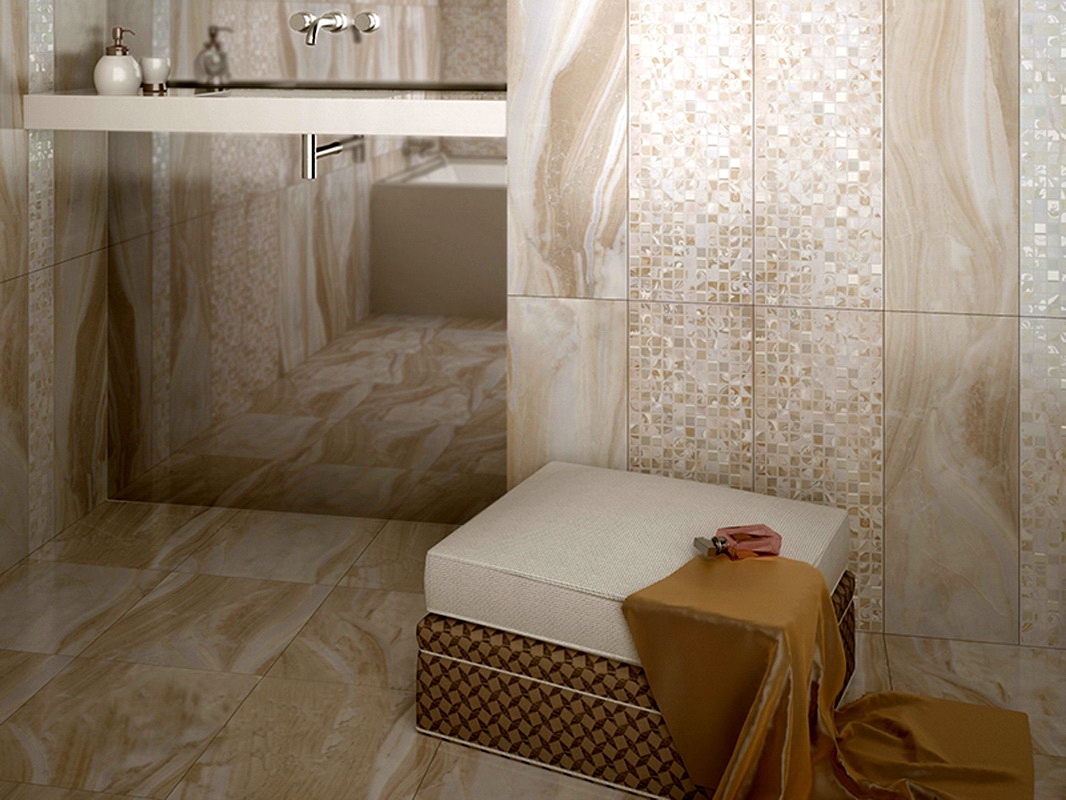
- "Savannah" - combines the combination of woody pattern and coarse fabric, matte surface and gloss.
- Alta - and again imitation of wood, this time of birch and ornament in the role of decor. Restrained and nice collection.
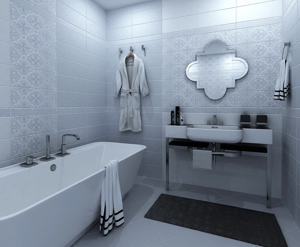
- "Valkyrie" - appears before us in two versions: a strict black and white scale and a passionate combination of red and white. Floral pattern applied using the embossing method.
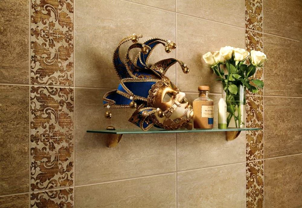
- "Damascus" - another embossed collection in oriental style, imitating silk.
- "Caramel" - Exquisite and rich shades of burgundy and dark chocolate, seasoned with floral patterns.
- "Vellet" - its creators were inspired by the elegance of lace, which enriched pearl play.
- "Defile" - this matte tile can give a different mood to the room: asceticism and restraint in black and white and bright solar feeling in white and orange tones.
- "Sparta" - it is iridescent marble surface of black and white colors with laconic Greek ornament.


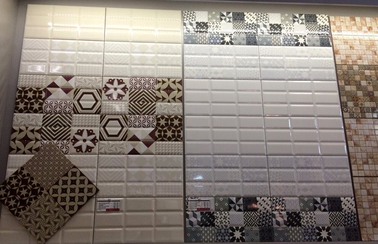
The theme of patterns continued to be embodied in the new year in the series “Magic in a Pattern”. In the catalog of 2011, we will find a shiny mirror surface and an unobtrusive pattern in the form of large flowers in the Solo lineup and patchwork decor in the Kamlot collection.
The gloss is the theme of the next year’s series. Rotational and digital printing and even traditional silk-screen printing have been used in the creation of decors in this series. Floral patterns, African motifs, cityscapes on the background of light colors were the following collections: Sanmarco, Ethel, Gloss, Aliante, Attica.
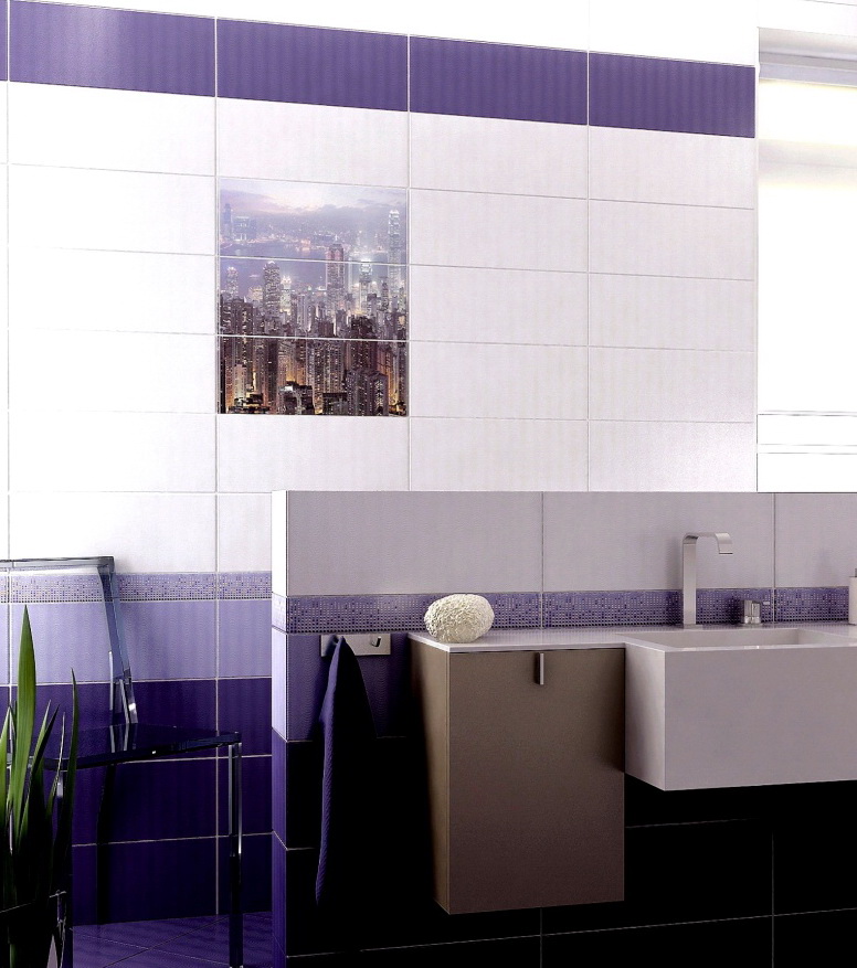
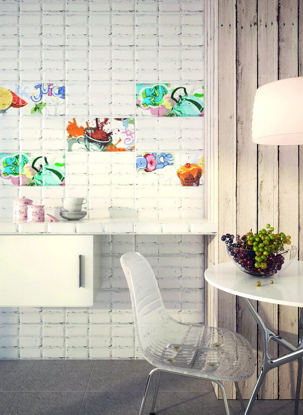
A series of "Geometry of the line" by the recognition of the creators is designed to capture the movement forward, the change of seasons, fashion trends. Here are eight collections that are completely different from each other. Two of them were designed specifically for the kitchen - this is "Vog" and "Loft". "Vog" is characterized by a relief texture of the main elements and colorful inserts in the form of still lifes and a coffee theme. “Loft” is an imitation of an old brick wall with decors in the form of graffiti or field flowers, which can be used alone or laid out in the form of panels.

The “Mood of Color” series, among other things, is distinguished by two independent samples of floor tiles suitable for the living room interior: Maison and Chalet, imitating parquet flooring.

The most productive year for the entire existence of the company is 2015. This year, as many as three series were born: "Dreams", "Melodies of Color" and Mariscos. Glossy and matte, textured and smooth surfaces, new patterns and ornaments, floral panels and even butterflies have enriched an already not a poor assortment.

The 2017 Game of Structures and Colors series is a madness of colors, textures and ornaments. With all this, their combination does not seem coarse, but, on the contrary, adds character to the room. The brightest collection of this series is, perhaps, Eclipse in indigo color.

Reviews
Customer feedback on the Azori product is mostly positive. Users note first of all the design and colors, which, being bright and saturated, nevertheless are not annoying. The quality of the tile overtakes the products of many competitors in its price segment. It is durable and, according to the tilers, easy to use. Without problems amenable to cutting and stacking.
There are not too many defective items.One of the drawbacks is the discrepancy between sizes within a couple of millimeters. Some users were faced with raznoton within the same collection, it is likely they caught samples from different batches. There was also a difference in the quality of the picture in different series. This parameter depends on the applied method of applying the image: silk-screen printing, rotational or digital printing.

Review of Azori ceramic tiles, see the next video.


