Green curtains in the interior: choose the right shade
In the modern interior of the home today are often found natural colors of the color palette. This also applies to such elements of interior composition as curtains. For example, one of the most popular shades today is green. However, few people know how to choose the right tone of green so that it blends harmoniously with the chosen design style.
Color features
Despite the common name, the green color may be different. This is manifested not only in the saturation of the tone, but also in its emotional coloring. In fact, green is perceived differently depending on which of the two emotional colors - red or blue will be more in it. Therefore, in one case it looks good in the interior, and in others it causes some discomfort.
In general, color is associated with inner harmony, tranquility and balance. Being a member of color therapy, it favorably affects the nervous system, relaxes the household, contributing to the normalization of sleep. It is effective also in cases when concentration of attention is necessary.
However, if there is too much yellowness in it, it will lose not only its attractiveness and freshness, but also bring heaviness into the interior.
On the other hand, too cold bluish, and at the same time rich color can make a kind of office out of a cozy room, which is also undesirable. The abundance of dark green in the interior can lead to depression, and excessive brightness will make the mood apathetic. Green curtains are good for optimists and emotional personalities. They can be used in different rooms of the dwelling and are suitable for people of different age categories.
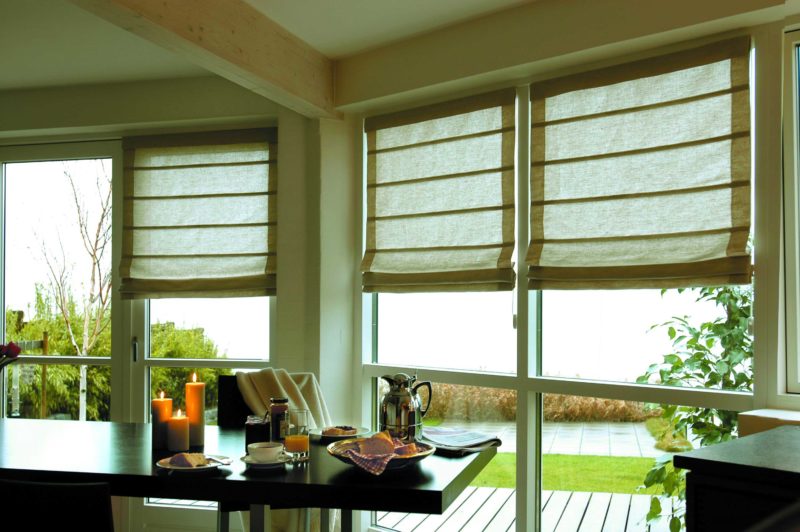
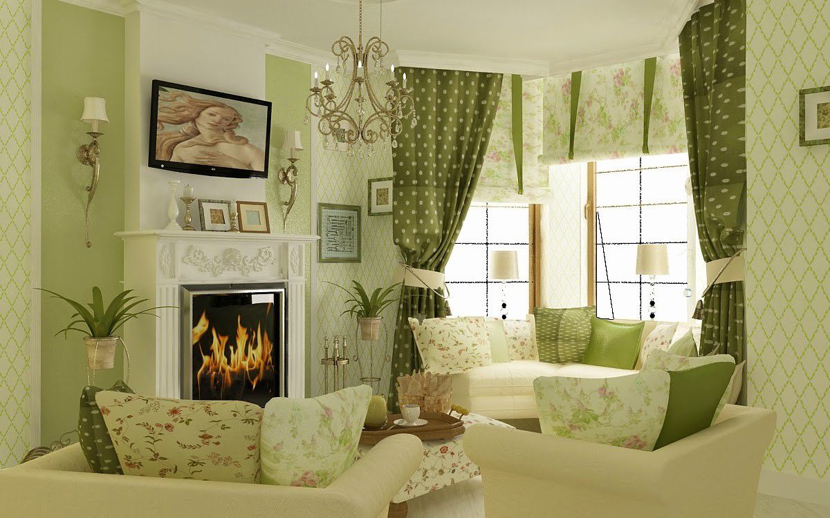
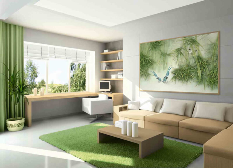
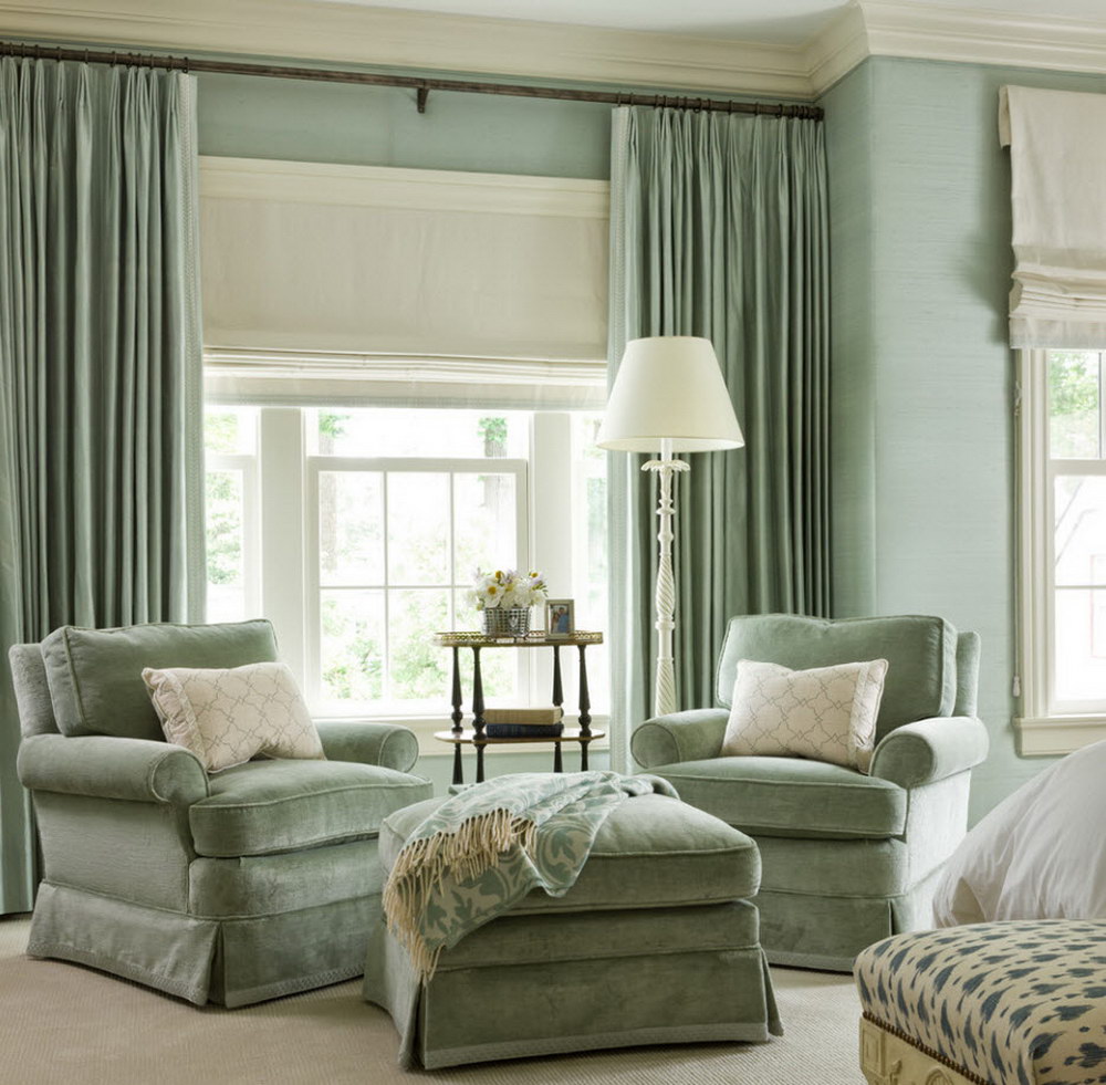
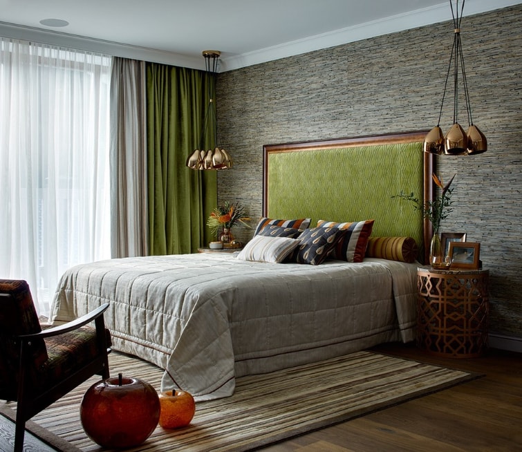
Light tones of green tune in to a confidential conversation. Green is considered the base color for the design of bedrooms, offices, living rooms, nurseries, kitchens. Glazed balconies and bay windows can be decorated with curtains of this color.With the right choice of shade, he will tune the household to positive.

What to consider when buying?
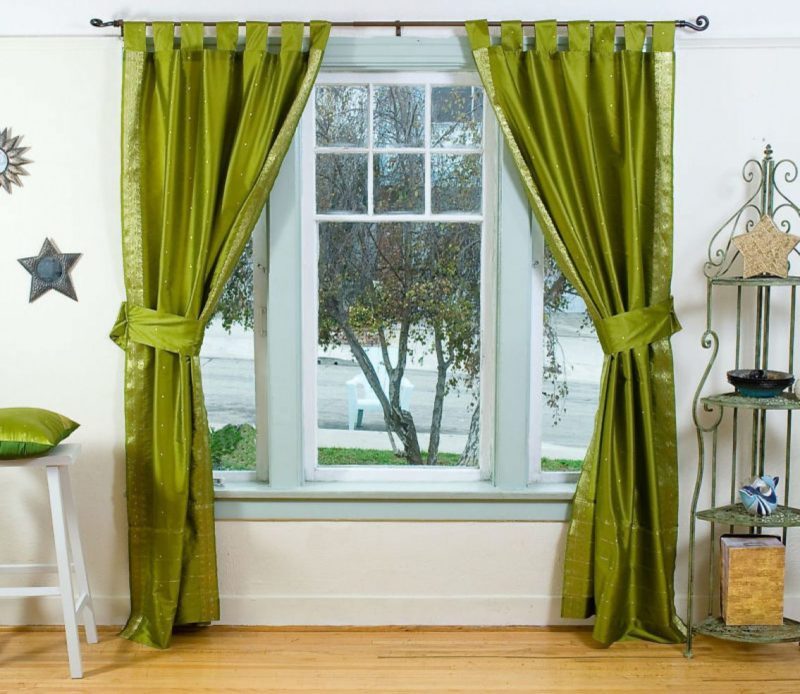
Choose a shade of green need not in the store, and at home. Initially, it is worth making a start on which side the windows of the room face, in which cloths will hang. For example, if this is the northern side, then buying products with an infusion of blue is undesirable, since the curtains will look more blue than green. A blue color is not suitable for every age category of household.
When the windows face the sunny side, curtains with an abundance of yellow are undesirable. This can lead to the fact that on the general background they will lose the attractive freshness and juiciness characteristic of green color. At a minimum, you need not to pick a yellow-green, but a green-lemon tone. If you decide on the selected shade immediately, it will transform the room.
It is important to take into account the saturation of the color, correlating it with the available furniture or wall cladding. For example, one of the most successful shades of green is pistachio. Regardless of the style you choose, it will look lighter than, say, green with red.
It has a better and dark green color, which is limited in the choice of style.
Saturation
To date, the most popular tones of green are light colors. At the same time they can have blotches of blue, white and warm yellow.
To make the right choice for decorating the windows of a particular room, it is important to consider:
- form of window openings;
- chosen interior style;
- the appointment of a specific room;
- color solutions for parts and accessories available;
- the number of windows in the room;
- the size of the room and the height of the ceiling.
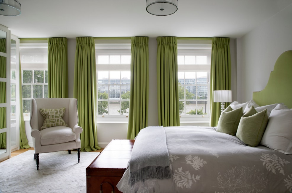
It is necessary to take into account the ability of color to visually change the parameters of the room. For example, light green curtains can erase the hard borders of the walls where the windows are located. The dark colors of the panels, on the contrary, instantly indicate the boundaries of the room and the height of the ceiling. If at the same time the room is not one, but several windows, there will be a lot of green.
The best solution for the design will be bleached shade (green, diluted with white). To support the curtains in such a case, the usual lively greenery or even a picture of the picture will suffice. More complex and rich tones need the same additions.
Otherwise, they will draw all the attention to themselves, which will negatively affect the interior composition.

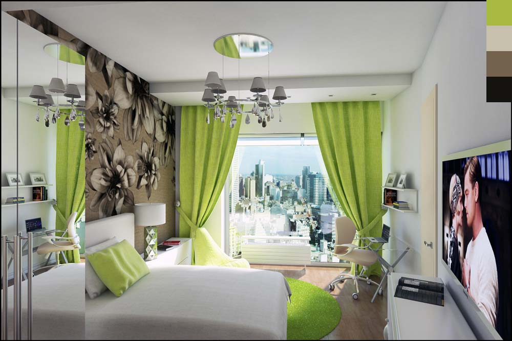
Figure and type of models
Choosing an ideal for yourself print of curtains, it is worth considering the size of a particular room. For example, a large print, even an unusual one, is able to reduce the already small space, which will bring a certain portion of negative perception of the room. Being in it will be hard, despite the fact that the color itself is quite pleasant and harmonious. For small rooms, monochromatic canvases with a concise type of design or cut are sufficient.
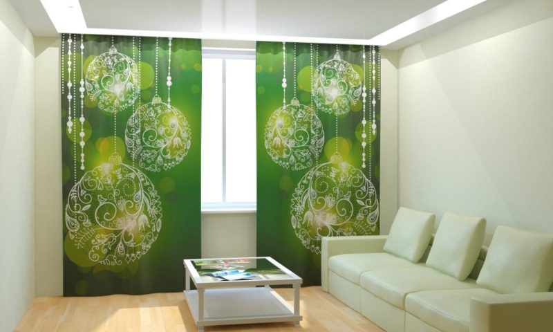
Choosing an unusual theme and design of curtains (for example, Japanese panels), it is worth considering their relevance in any season of the year. If you want to decorate the room with curtains with the image of Christmas toys, you should think about how they will look in the summer. The same can be said about the so-called photo curtains or products with a 3D effect, which depict the jungles of Africa. If we dwell on something creative, let it be geometric or ethnic ornaments, hieroglyphs.
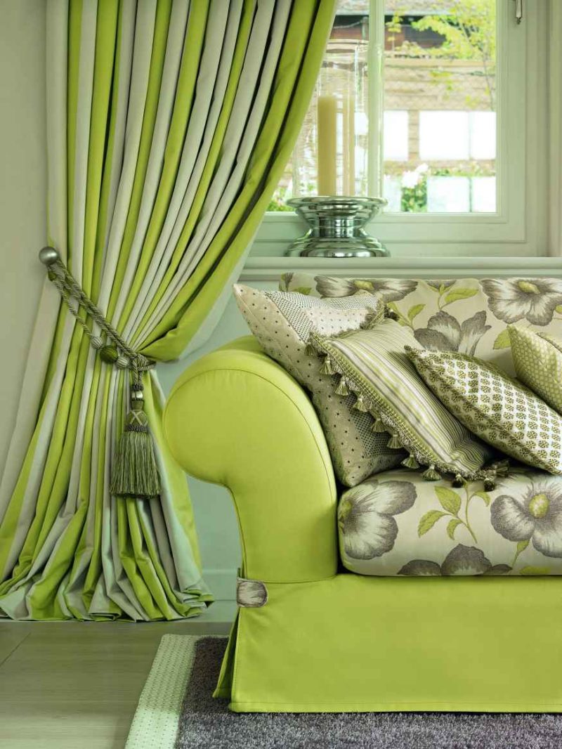
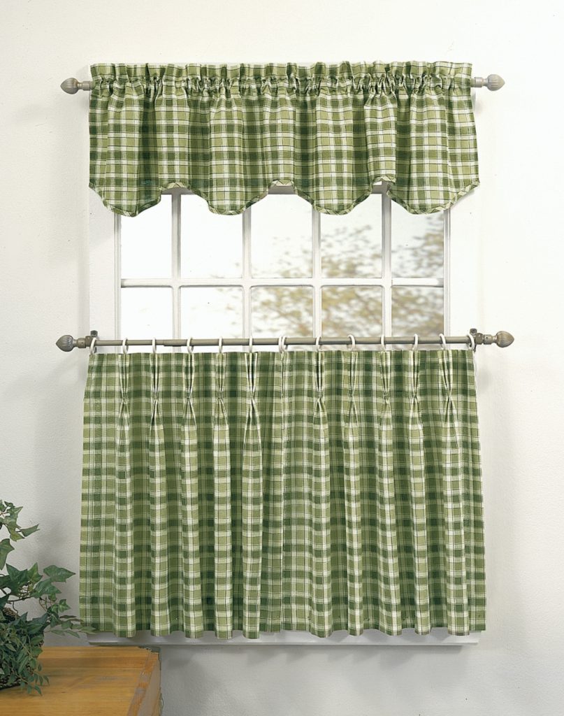
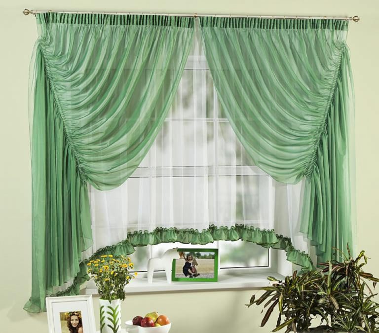
An equally interesting solution will be green curtains of a laconic cut with loops, if their base is located from half of the windows, and the narrow upper part creates an imitation of a frill, having its own fastening.This design, in addition to the pot with greens, does not need any other support for harmonious infusion into the interior of the room. In this case, the texture of the fabric can be natural.
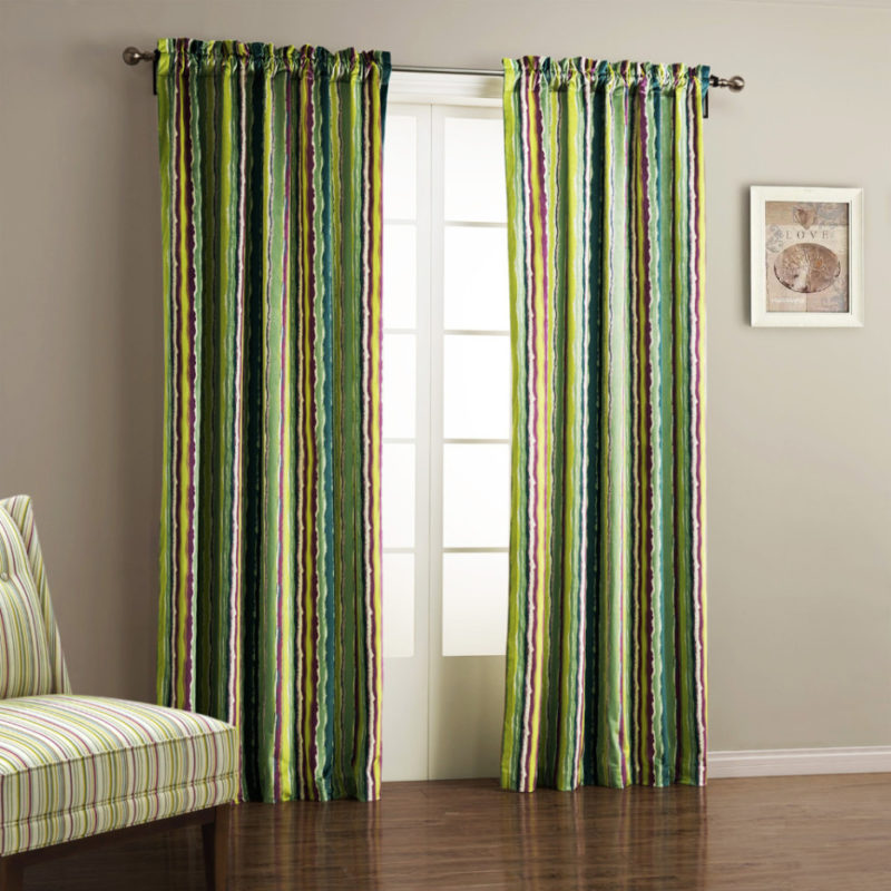
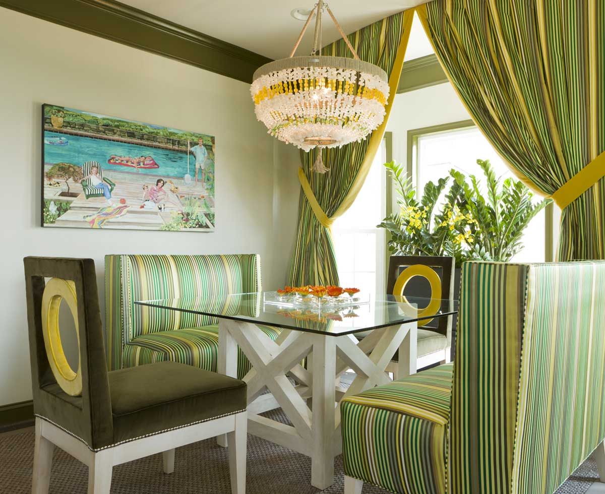
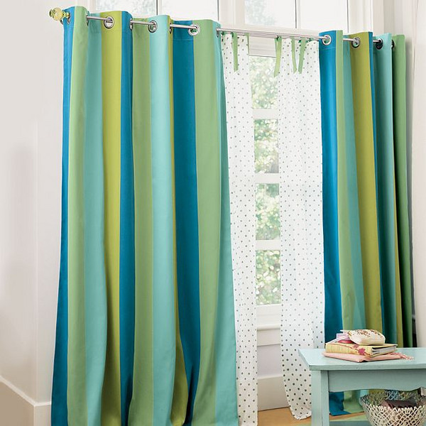
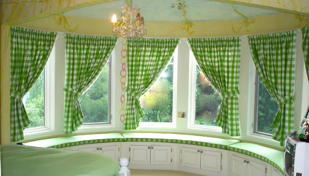
It is undesirable to give preference to colorful striped panels, and even with the addition of red or black. If they can look unusually close, it will create a ripple in the eyes against the general background. It is better to choose a monophonic product with an embossed print, rather than an abundance of incomprehensible contrast. If you really want a strip, you should pick up a wide strip of cool green and white.
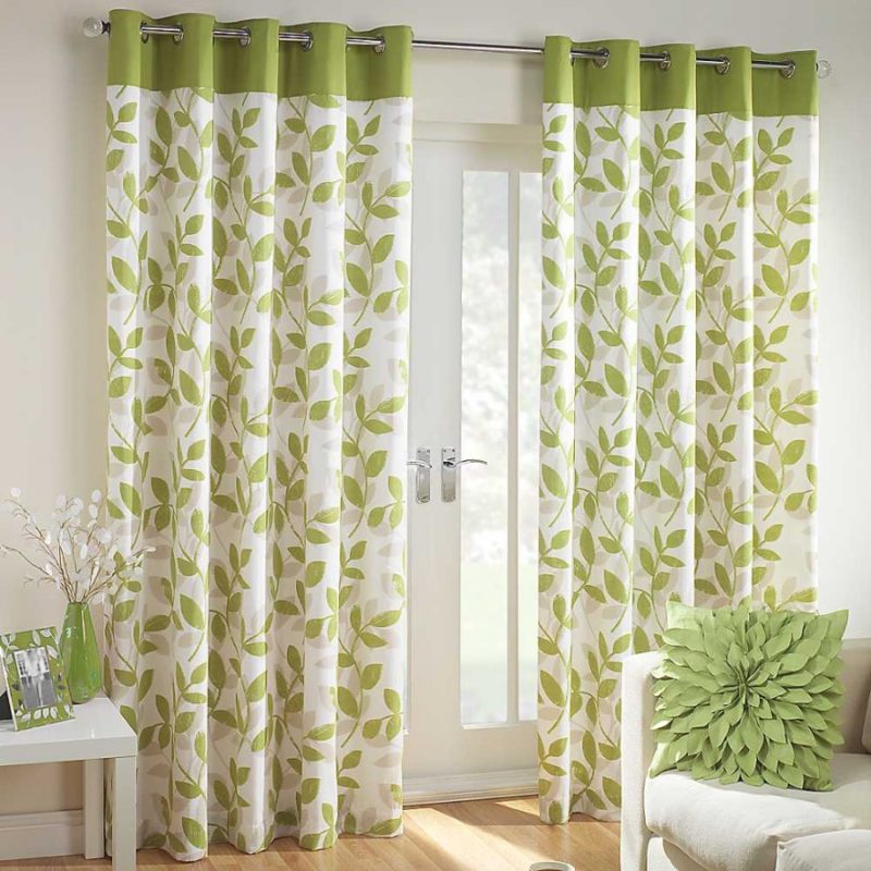
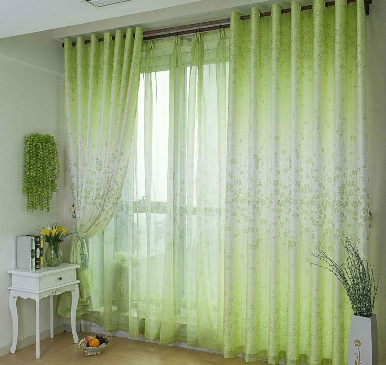
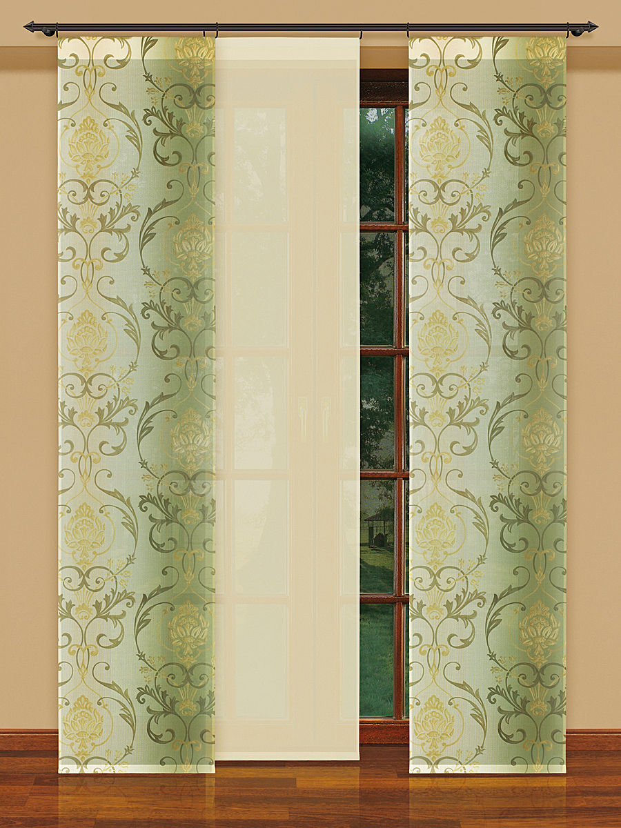
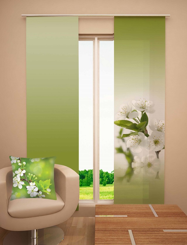
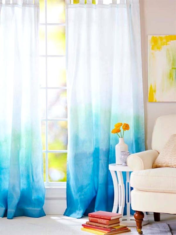
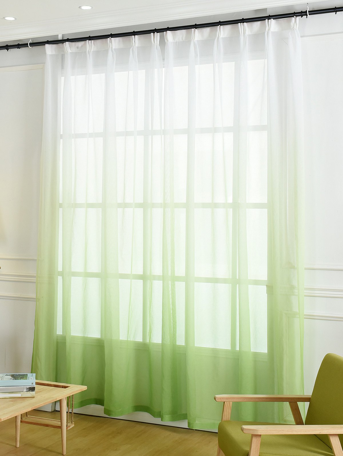
Green curtains with floral designs, hanging vines, individual twigs and leaves are harmonious in the design of windows. For children you can buy bright curtains with white tulle, studded with butterflies. Ombre models are also good, in which a gentle greenish-blue shade smoothly turns into white.
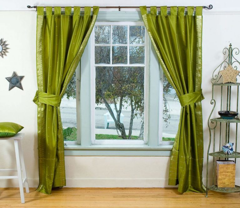
With regards to finishing, it is worth highlighting the relevance of satin edging to match the color of the panels, as well as edging with tassels.
Does style have a choice?
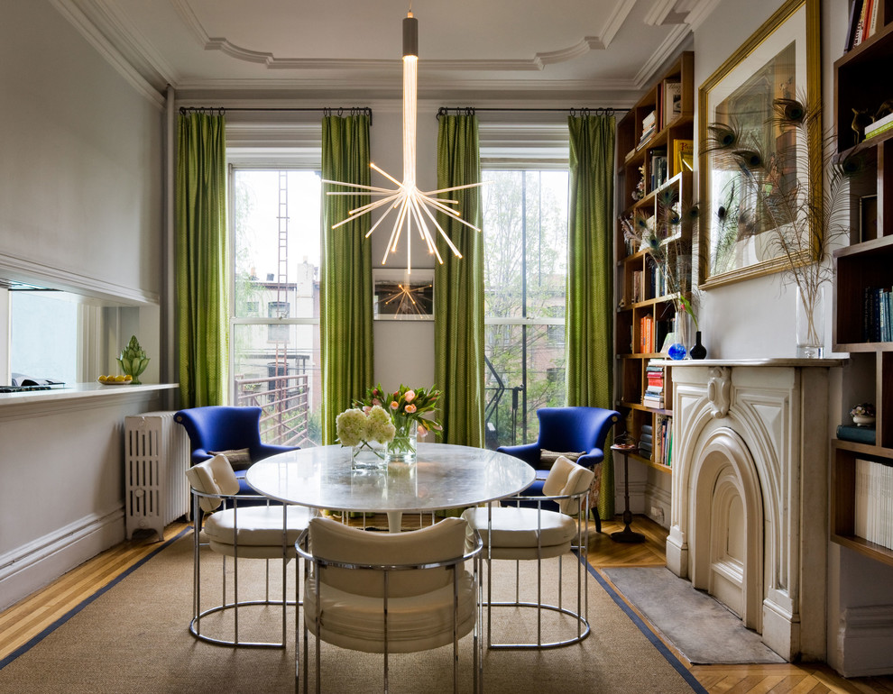
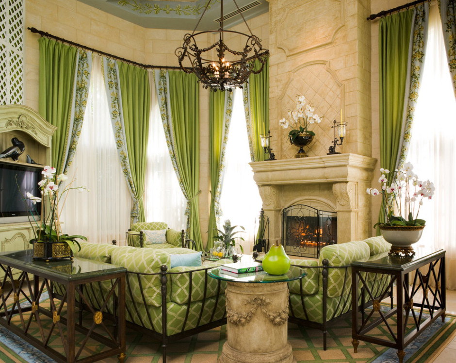
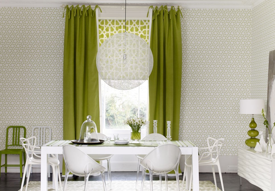
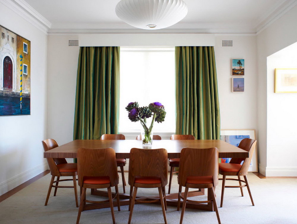
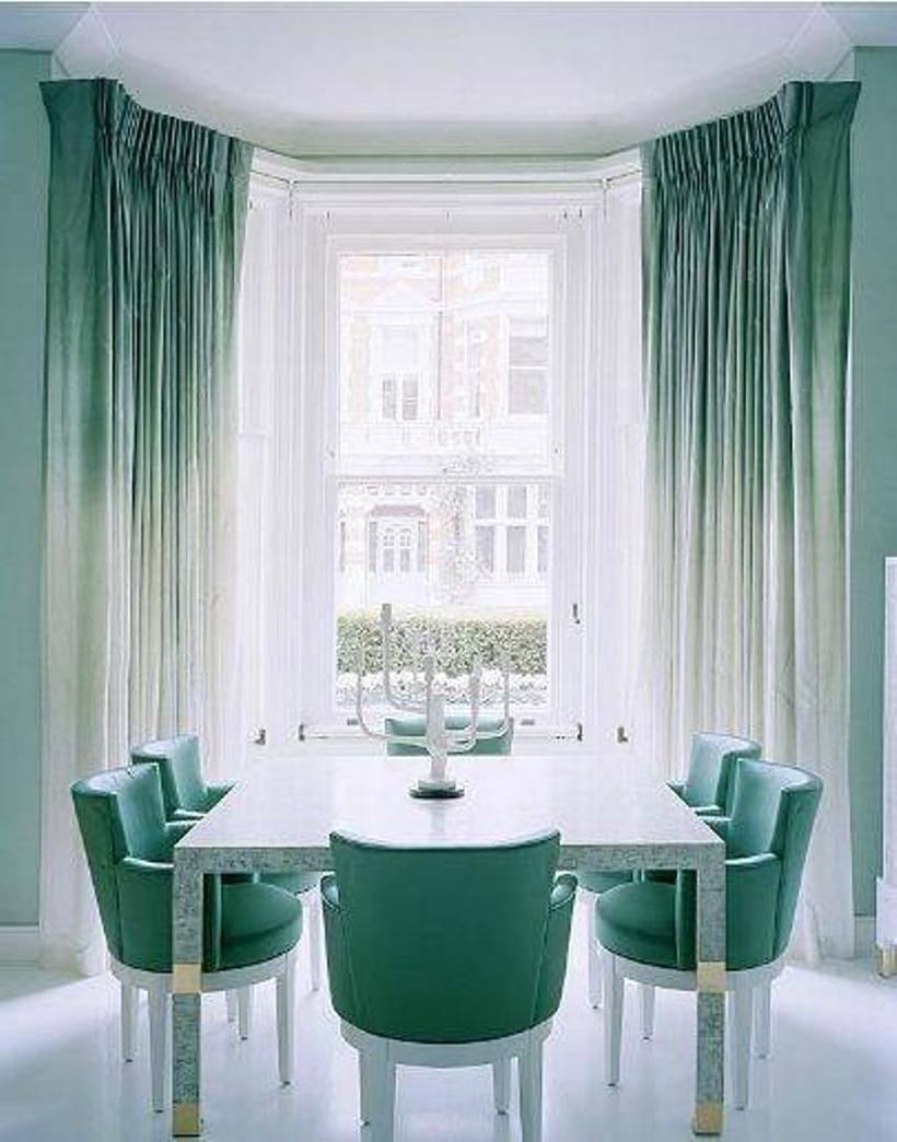
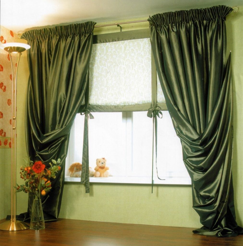
Of course, the shade of green for each direction of the design is different. For example, for a classic-style living room, golden-green light curtains will suit.At the same time, besides the texture itself, no other decoration and pattern is needed: there is enough gold in the fabric, which is typical of the classics. In this case, complex draperies or thick textiles are not needed either: the same satin curtains will look much more effective than velvet.

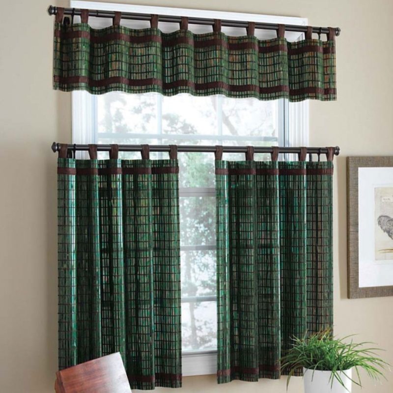
If one of the eastern directions is chosen as a basis, it is worth giving particular importance to the material. This is due to the fact that in the interior composition of Asian countries there are no insignificant trifles: everything breathes with naturalness and history. Curtains can be short, panel, the picture on them should bear the imprint of a certain historical era. In this case, the shade of the material used should be soft, muffled.
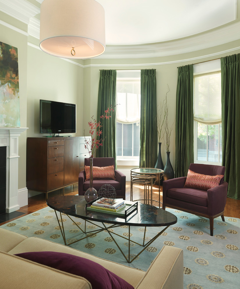
If green is part of such chaotic trends as avant-garde or kitsch, the most unusual combinations of colors are welcome here. Green can be combined with pink, red, orange, purple. However, such decisions are unlikely to be understood by all households, and not everyone can be constantly in such a riot of colors.
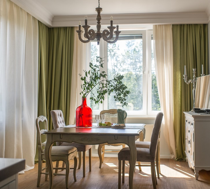
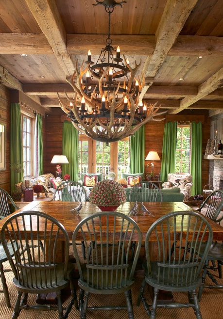
Green curtains in the interior of Provence, country and even Turkish style look much more interesting.
In different rooms
If the question of choosing a shade remains open, you can listen to the recommendations of experts.
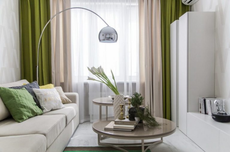
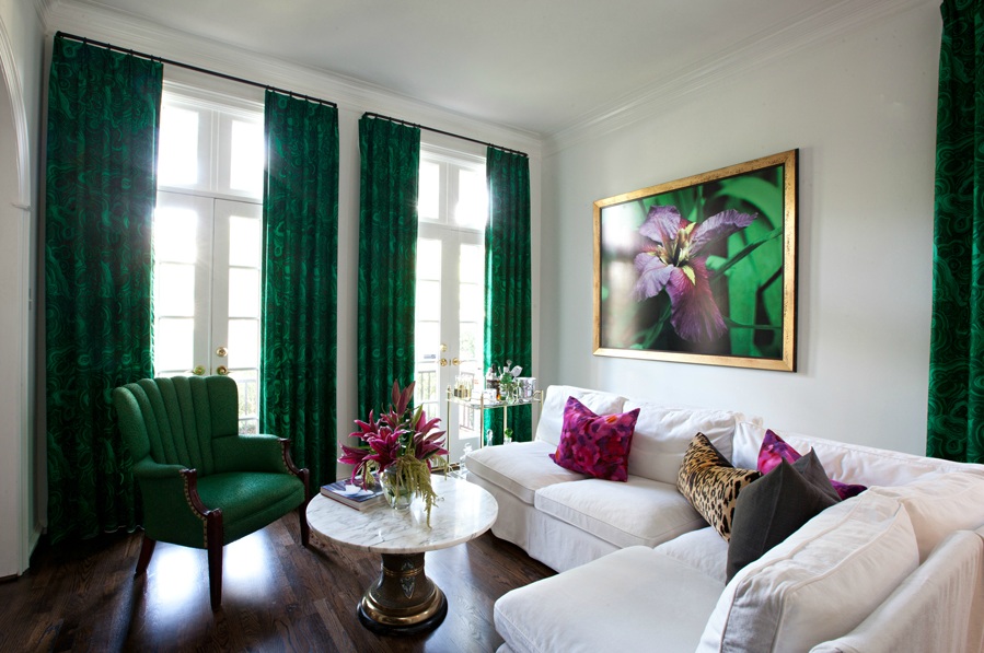
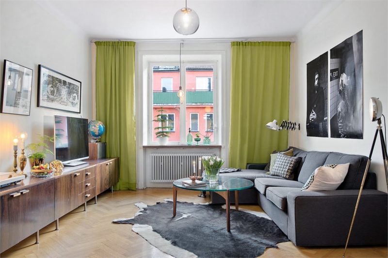
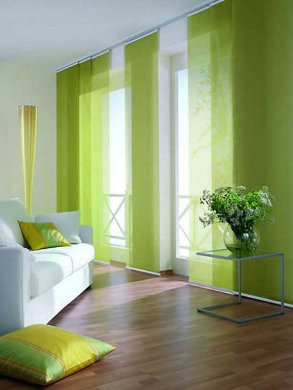
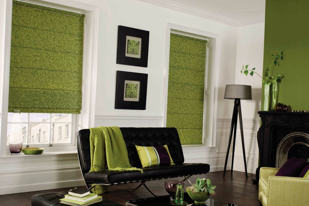
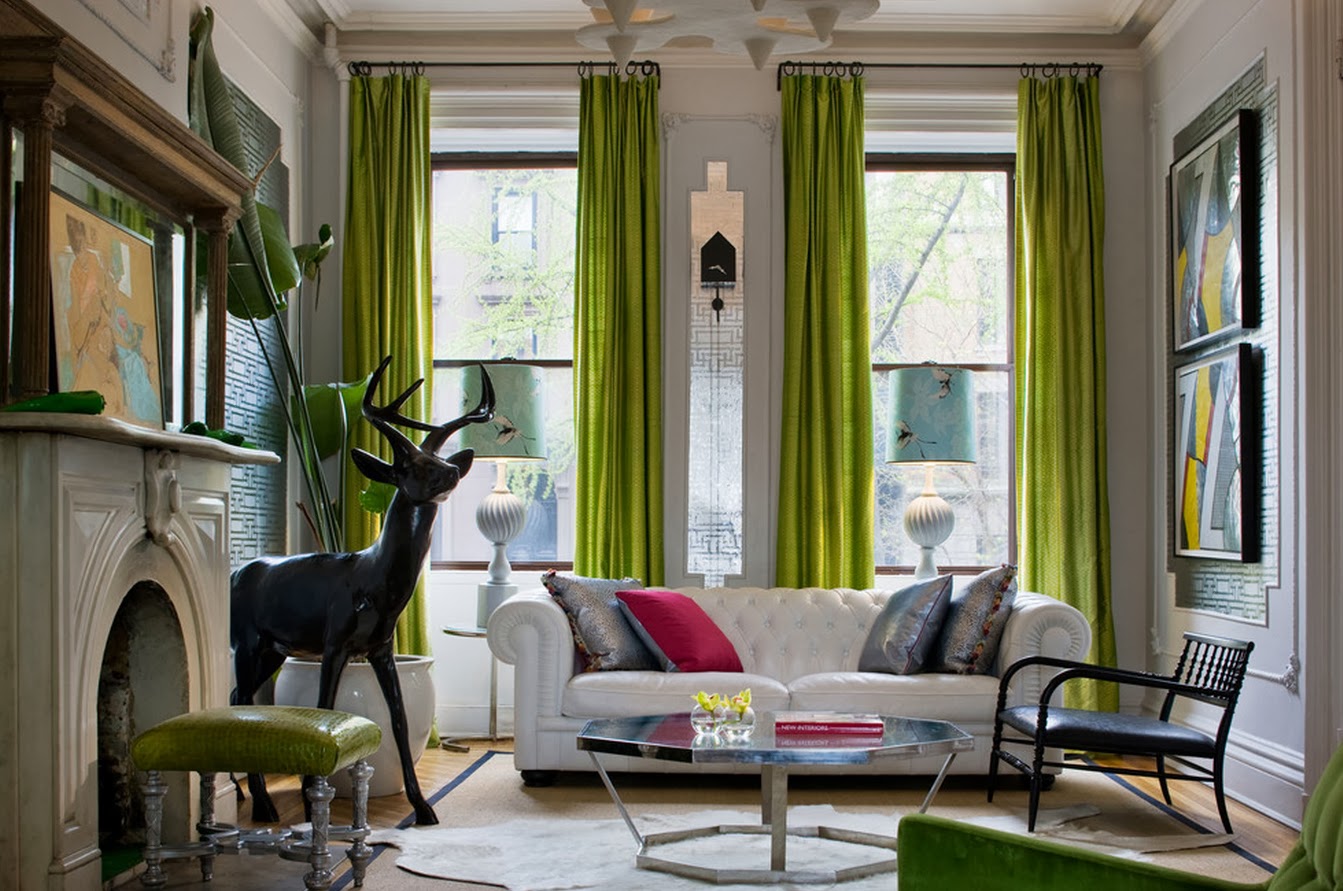
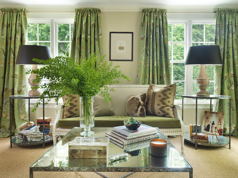
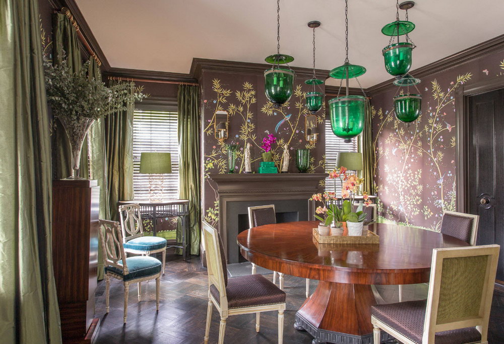
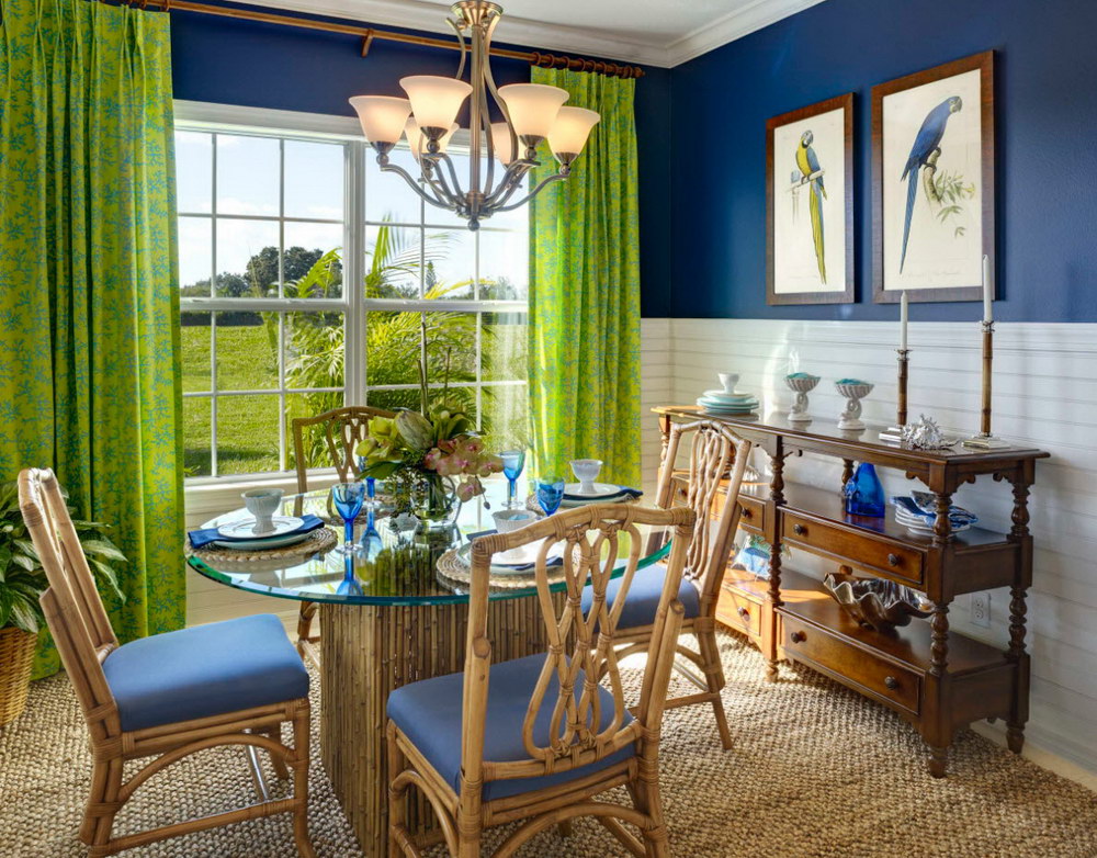
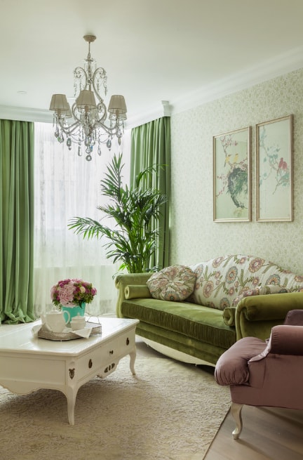
- Bright curtains and contrasting combinations look good in the living room. In the hall on the windows you can hang a three-layer model of green with a brown tone and white tulle.
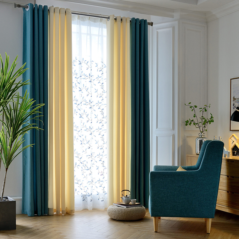
- Good in the living room and blue-green curtains. To make them look harmonious, you can add to the decor a pair of cushions of identical or related color.
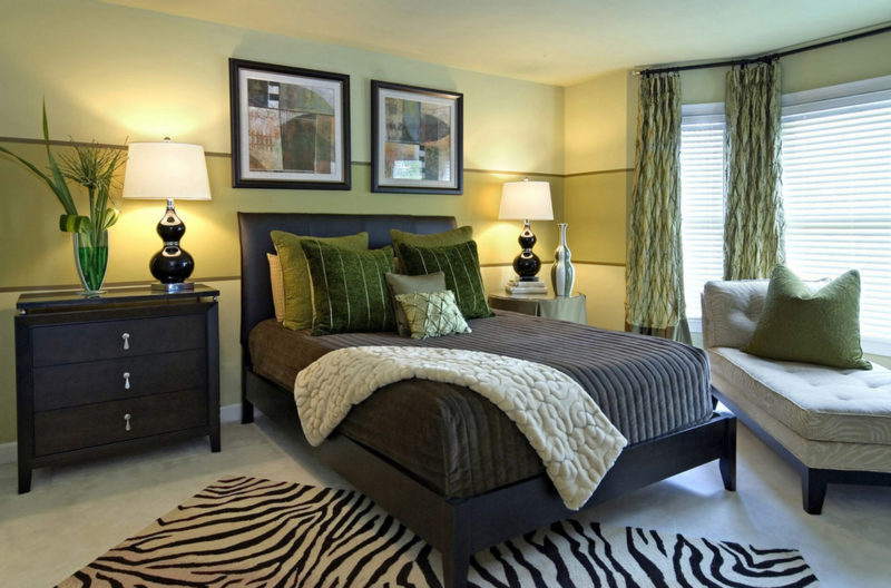
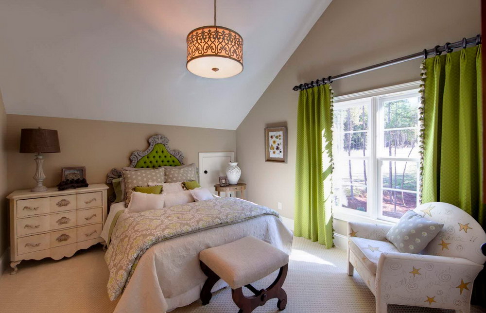
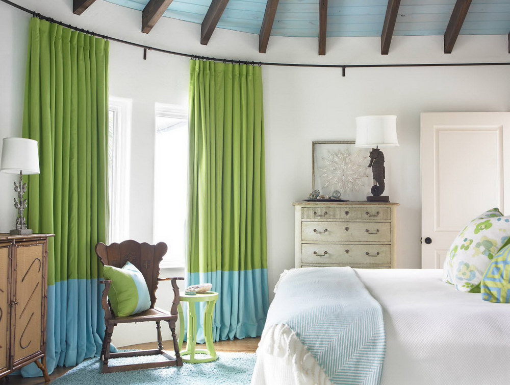
- To be sure, you can consider buying curtains with an ombre effect, in which cold green is gradually replaced by warm. You can hang them not only in the hall, but also in the office or bedroom of adults.
- Products with a red decor or print are not in harmony with anything. This is a taboo for room decoration. These tones do not fit together.
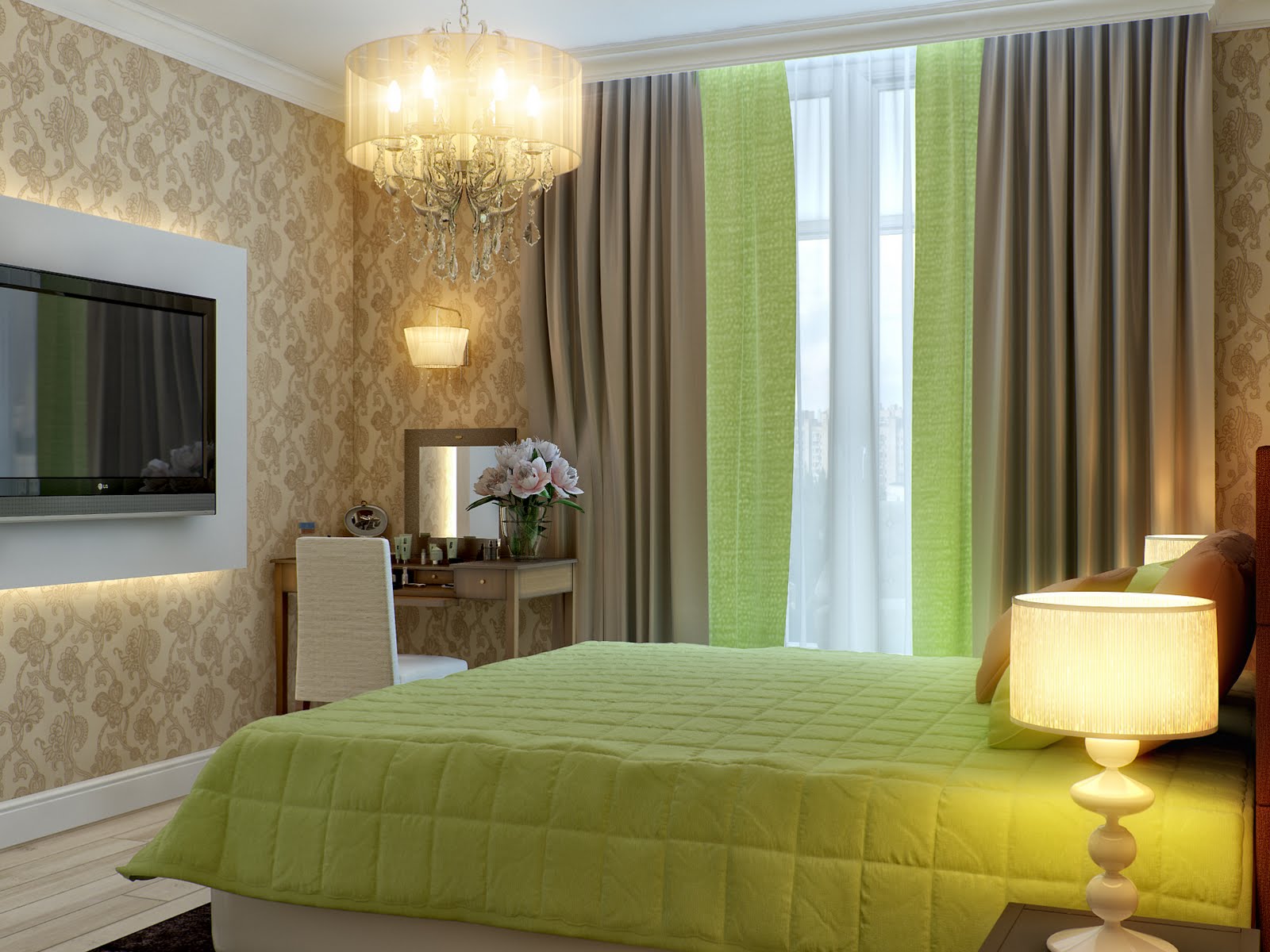
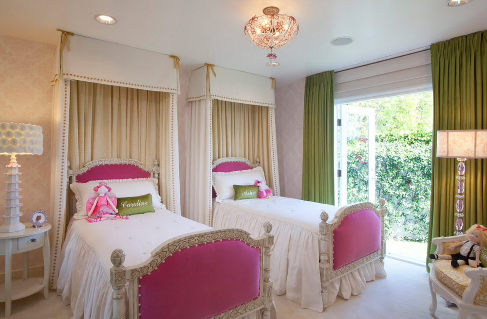
- In the children's bedroom you can take only light neutral or warm colors. Light green panels and contrasts with beige will do.
- Pink-green combinations are good for children, but are not suitable for decoration of bedrooms for adults. Yellow-green mixes should be added to the interior of such rooms with care.
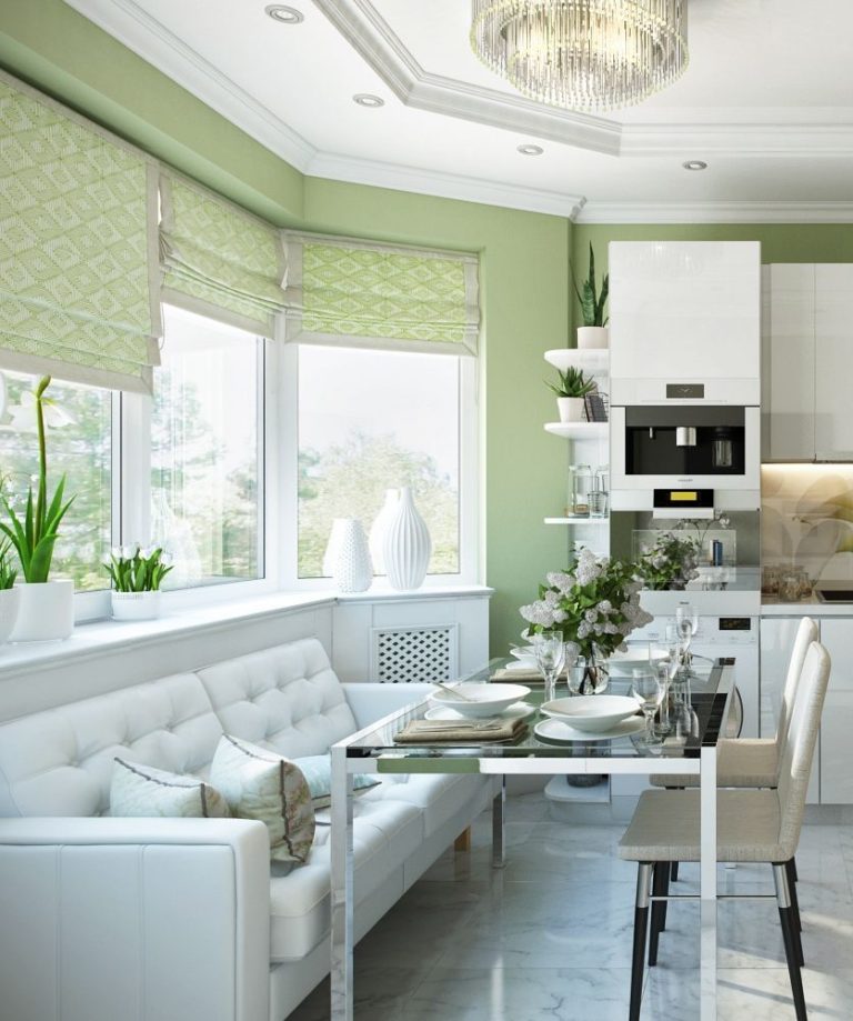
- In the kitchen the best solution would be to choose a short curtain of light pistachio color.It can be both monophonic products, and options with green vegetable pattern on a white background.
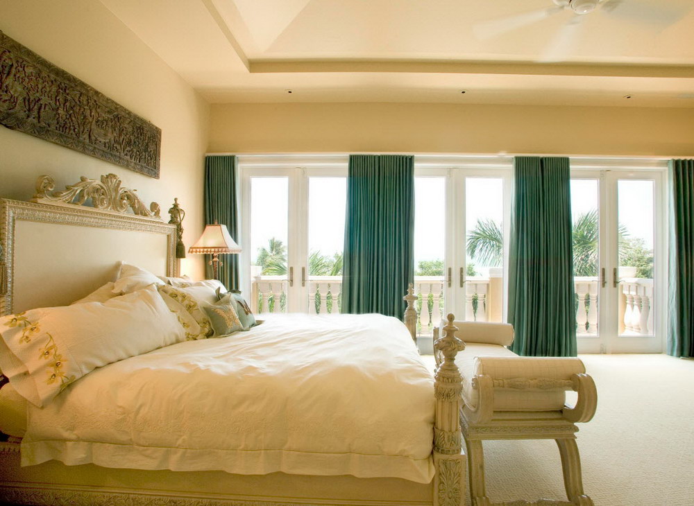
- Hue matters: it is more comfortable for asthmatics to be in rooms with cold tones (green with blue will be the best solution in this case).
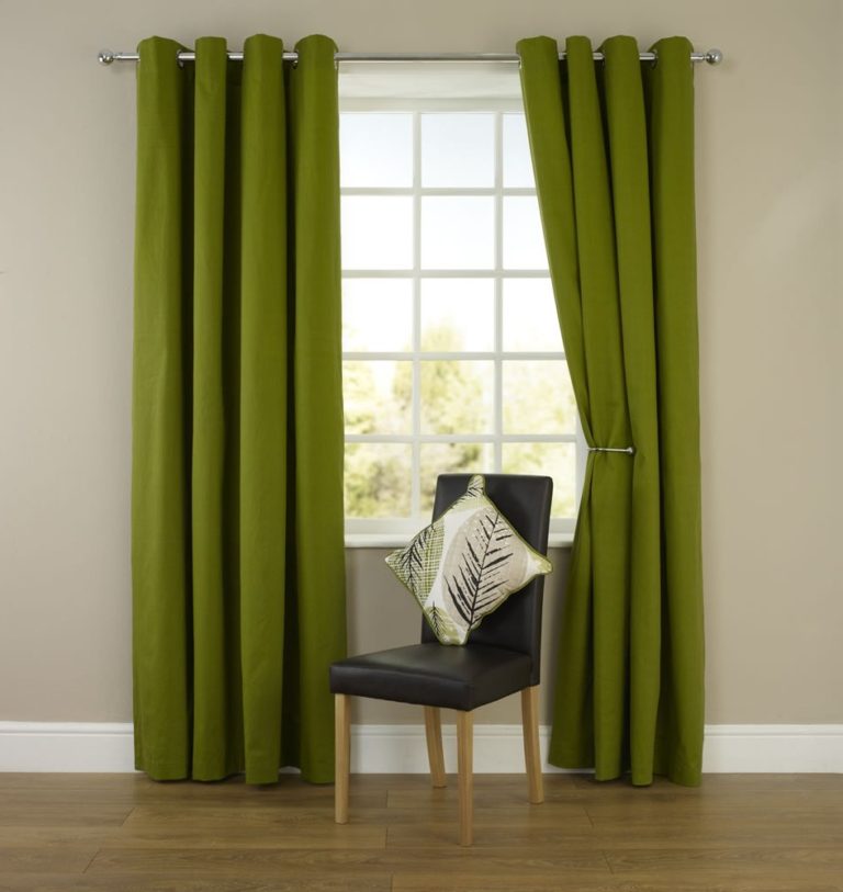
- Plain curtains in bright green colors are suitable even for creative design directions (loft, grunge).

- Juicy green color needs to be dosed. Its abundance leads to the loss of expressiveness of curtains as an accent of a particular room.
You will learn more about green curtains in the following video.


